Copyright: CC0 1.0
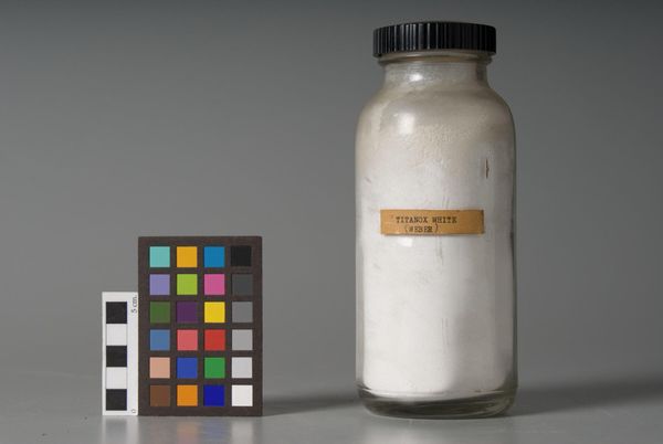
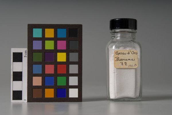
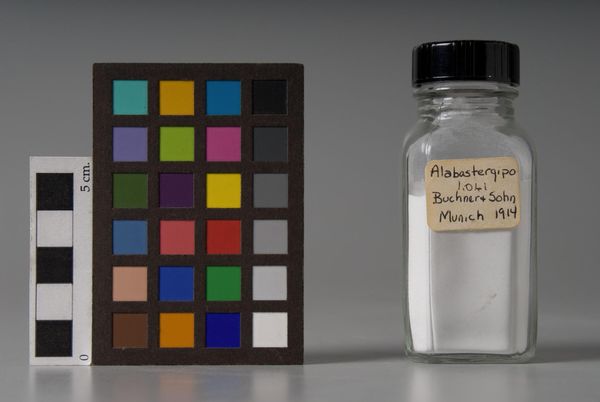
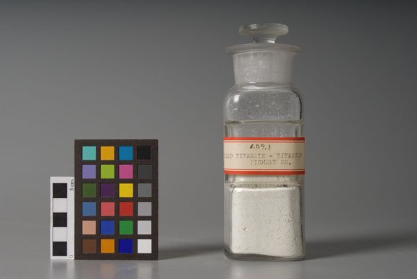
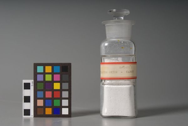
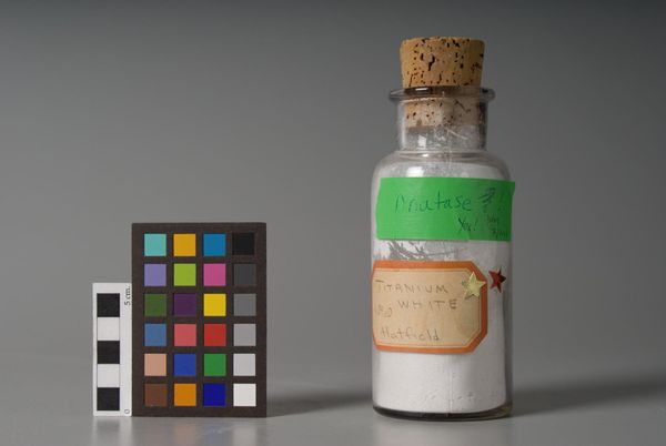
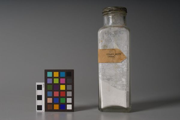
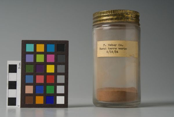
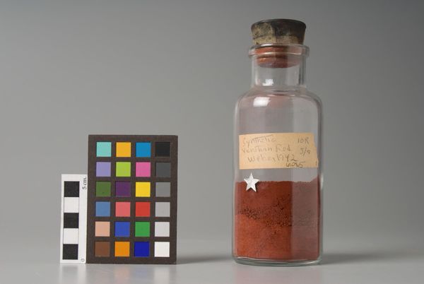
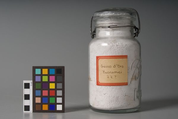
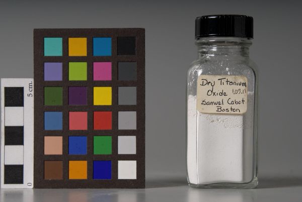
Editor: Here we have "Zinc White," made by F. Weber & Company. The starkness of the white powder against the gray background creates a really interesting contrast. What are your initial thoughts on the composition? Curator: The composition immediately directs attention to the interplay between object and representation. The bottle, a vessel, becomes an object of study, while the color chart beside it presents a segmented system of codified chromatic values. Editor: So, you're saying the juxtaposition highlights different ways of seeing and categorizing color? Curator: Precisely. The formal arrangement invites us to consider the aesthetic qualities of both the manufactured pigment and the methods by which we perceive and classify it. What do you take away from this? Editor: I see now how the arrangement asks us to think about the essence of color itself. Curator: Indeed. A potent exploration of form and perception.
Comments
No comments
Be the first to comment and join the conversation on the ultimate creative platform.