Dimensions: object: 900 x 1550 x 795 mm
Copyright: © Peter Randall-Page | CC-BY-NC-ND 4.0 DEED, Photo: Tate
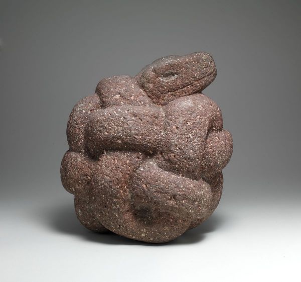
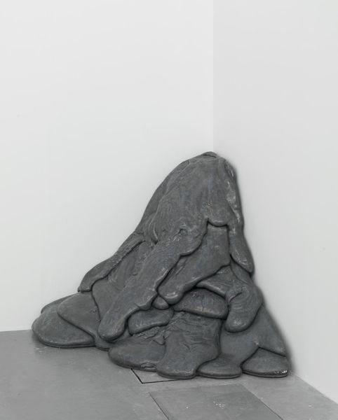
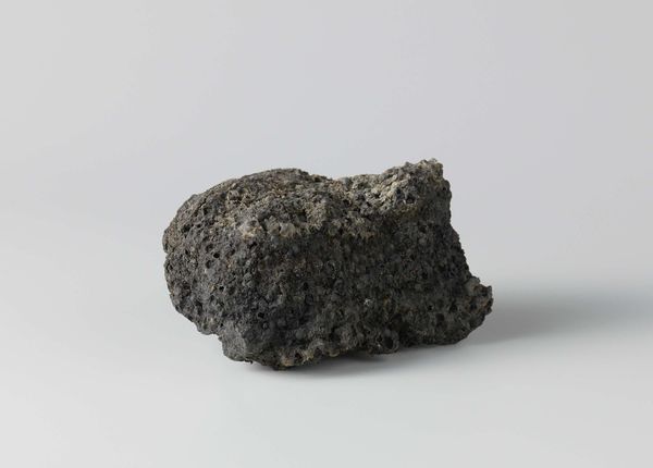
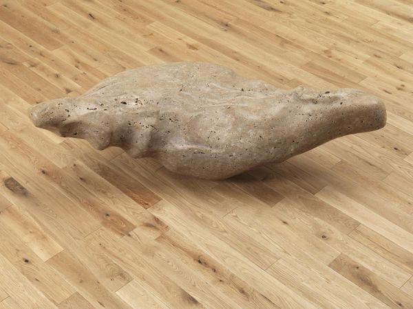
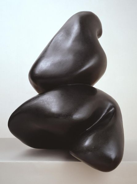
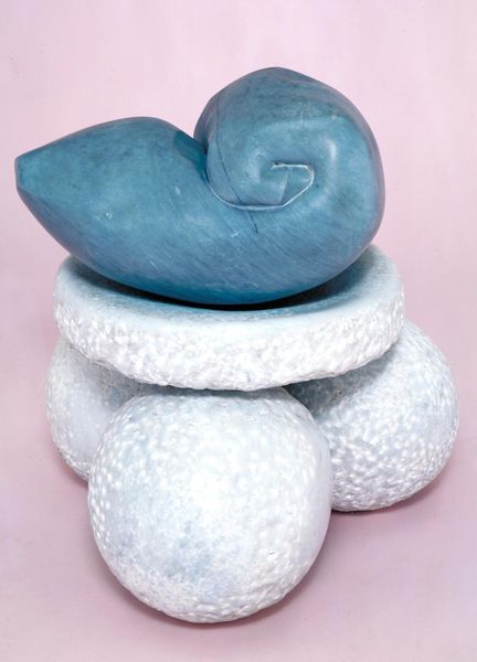
Curator: Peter Randall-Page's sculpture, titled "Where the Bee Sucks," immediately strikes me with its dark, almost brooding presence. What's your initial impression? Editor: It feels primordial, like a cluster of volcanic rock. The material itself, that dark stone, speaks of geological time scales and intense pressure. Curator: The title, taken from Shakespeare, gives it a symbolic layer, connecting nature, the sweetness of life, and perhaps even a sense of fleeting beauty. I wonder if the artist is suggesting a parallel between the bee's work and the sculptor's. Editor: Interesting. The artist’s labor is undeniable. Consider the sheer amount of stone removed to create this form. It's a testament to human effort and the manipulation of natural resources. Curator: And the sphere motif recurs throughout Randall-Page’s work, a symbol of wholeness or the potential within a seed. Editor: Looking at the means of production and its cultural context really puts it in perspective. Curator: Indeed. This is a dense little work, in all senses. Editor: It gives pause for thought.
Comments
tate 12 months ago
⋮
http://www.tate.org.uk/art/artworks/randall-page-where-the-bee-sucks-t06748
Join the conversation
Join millions of artists and users on Artera today and experience the ultimate creative platform.
tate 12 months ago
⋮
Peter Randall-Page works chiefly in stone and often shows his sculpture in the landscape. Like a number of artists who gained recognition in the 1980s he addresses issues concerning the relationship between man and nature. At the same time he uses forms and carving techniques that link him to modern sculptors from earlier in the century. In recent years he has made large works based on natural elements such as fruit and seeds and also body parts. This work seems to combine references to vegetable and human forms and appears both vital and slightly menacing. The artist has emphasised the contrast between the hard, inert nature of the stone and the organic and soft looking shapes into which it has been transformed. Gallery label, September 2004
More like this