drawing, print, metal, engraving
#
drawing
#
baroque
# print
#
metal
#
pen illustration
#
old engraving style
#
classical-realism
#
form
#
line
#
decorative-art
#
engraving
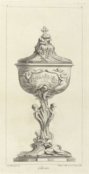
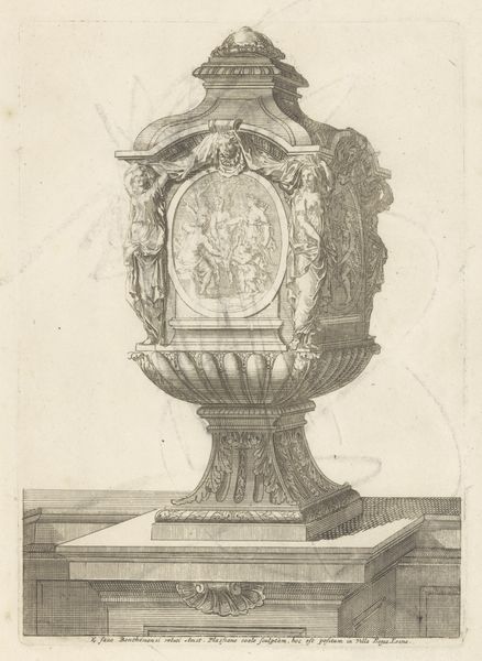
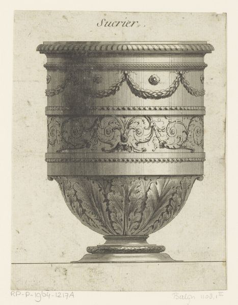
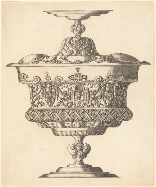
Dimensions: height 250 mm, width 165 mm
Copyright: Rijks Museum: Open Domain
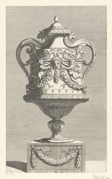
Editor: Here we have Gerrit Visscher’s "Paneelversiering met tuinvaas en monogrammen," a decorative panel created between 1690 and 1710, using engraving techniques. It’s quite intricate, a monochrome design with the urn as the focal point. How do you read the complex forms? Curator: Formally, the print operates through a hierarchy of shapes and lines. Note how the central vase is constructed through a series of carefully balanced curves and sharp angles, achieving a sense of visual stability. The framing rectangle is quite interesting: observe its contrast with the curvilinear forms within. What does that juxtaposition communicate? Editor: Well, the sharp, straight lines of the frame highlight the roundness and ornateness of the vase. It draws your eye toward that central object and its detail. Curator: Precisely. The repetition of the monogram motif in circular and rectangular formats also directs attention. Semiotically, these repeated, stylized forms indicate a clear order or pattern for decoding the artwork's intended purpose: decorative function, status marker, emblem. The arrangement dictates the art’s functionality and visual weight. How effective do you think this piece is in that sense? Editor: It's definitely effective. All the design choices point to something visually arresting, like it’s meant to showcase wealth and refinement through carefully calibrated artistry. Thanks, this has opened my eyes to all the different layers. Curator: Indeed. By recognizing how lines, shapes, and recurring forms communicate a visual narrative, we gain valuable understanding.
Comments
No comments
Be the first to comment and join the conversation on the ultimate creative platform.
More like this