painting, acrylic-paint
abstract-expressionism
painting
acrylic-paint
acrylic on canvas
abstraction
monochrome
Copyright: Mark Rothko,Fair Use
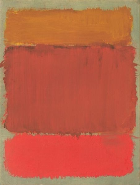
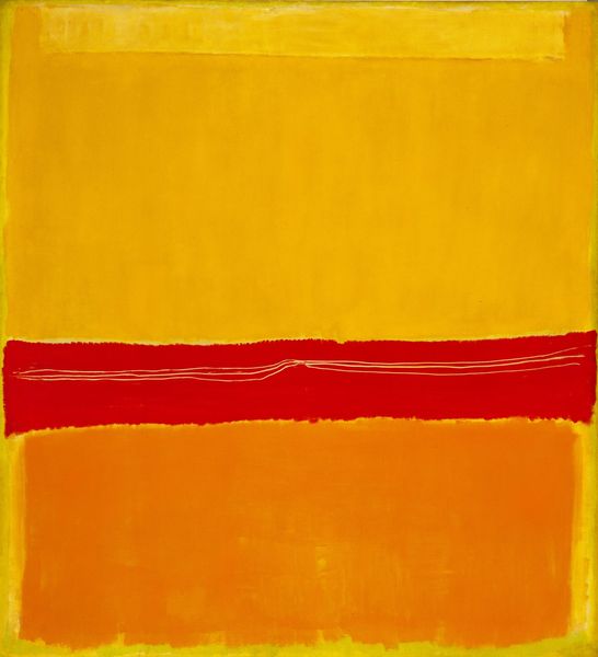
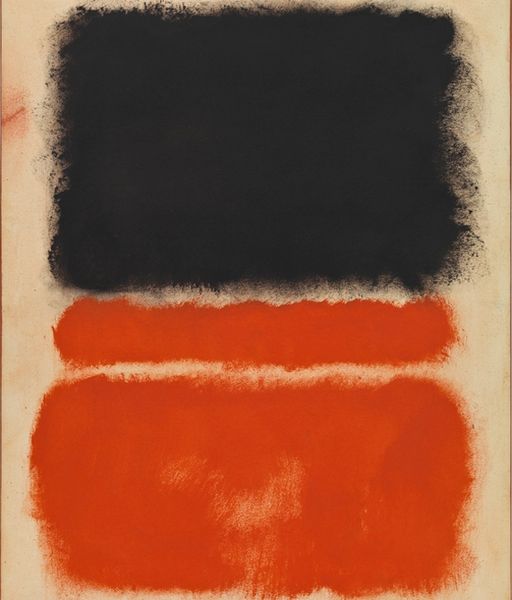
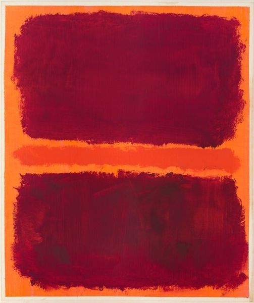
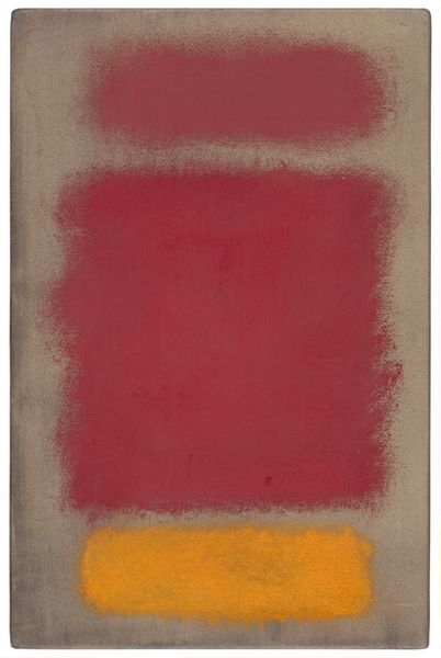
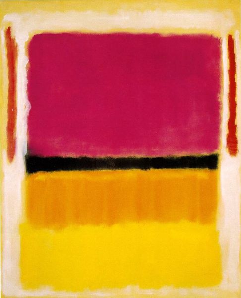
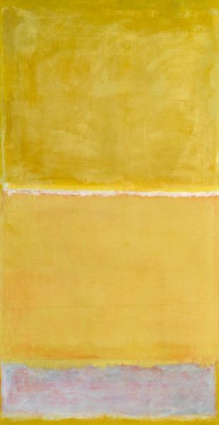
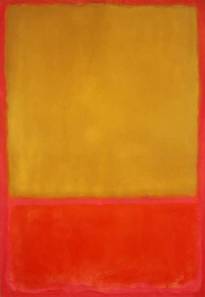
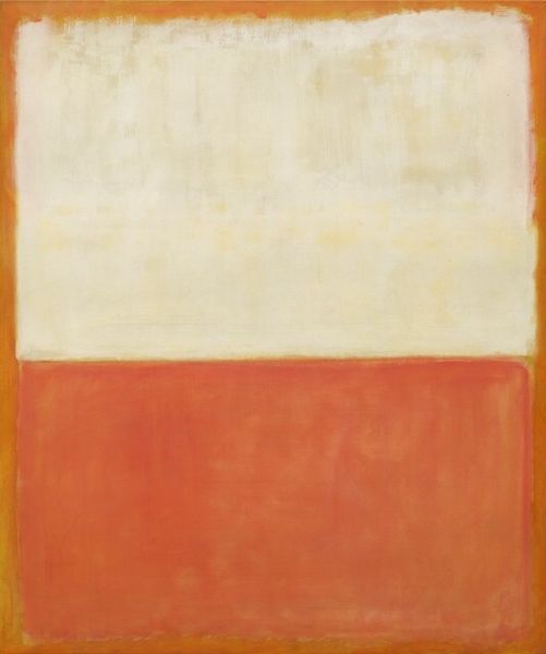
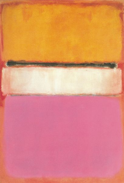
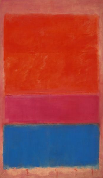
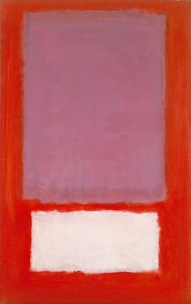
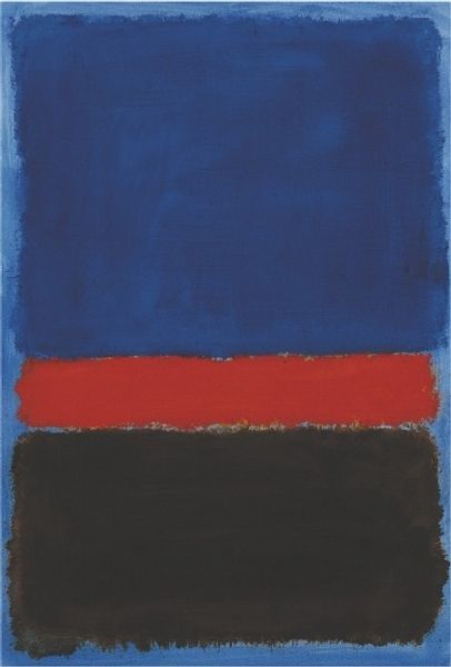
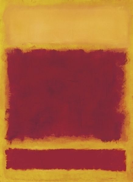
Here we have Mark Rothko's 'Number 24,' an untitled work, likely made with oils on canvas. Rothko's process feels very intuitive, almost like he’s letting the colours find their own space. Looking at it, there's this grounding red at the bottom, moving into a bright, sunny yellow, then a stark white stripe, and finally, a brooding, dark plum at the top. The paint isn't overly thick, but you can see the texture, the subtle layering, like he's building up these luminous fields of colour. See how the edges of each colour block aren't hard lines? They're soft, blurred, like they're breathing into each other. It's in those blurry bits that the magic happens. That little white line that he puts between the yellow and the plum colour feels like a burst of light, like hope. Rothko's paintings remind me a bit of Agnes Martin's grids, but with a whole lot more emotion thrown in. I think the best way to look at a painting like this is to simply let it speak to you, to let the colours wash over you.
Comments
No comments
Be the first to comment and join the conversation on the ultimate creative platform.
