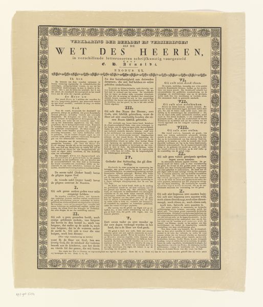
graphic-art, print, typography, engraving
#
graphic-art
#
neoclacissism
# print
#
typography
#
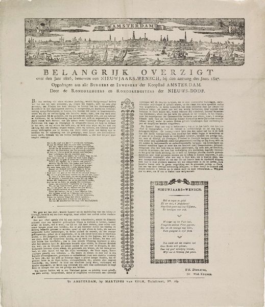
cityscape
#
history-painting
#
engraving
Dimensions: height 540 mm, width 450 mm
Copyright: Rijks Museum: Open Domain
Curator: Look at this intriguing piece, simply titled "Volksoverweging" – or roughly translated as "People’s Consideration." It's an engraving and piece of typography from 1787, held at the Rijksmuseum. It comes to us from Martinus van Kolm, both artist and, quite literally, printer. Editor: Immediately striking. The contrast between the image and dense text creates an almost claustrophobic feel. Visually, I’m drawn to the city scene at the top, despite the overwhelming amount of text. Is it an etching or some form of early lithography perhaps? The materiality appears cheap, perhaps suggesting mass-produced propaganda or social critique meant for broad dissemination? Curator: It’s an engraving, likely produced on a copper plate and then printed using moveable type for the text. As for your idea of broad dissemination, you may very well be on to something: this artwork coincides with brewing political unrest in the Netherlands. The work reflects the anxieties and patriotic sentiments around civic engagement and self-governance at a really pivotal moment. Editor: Ah, so the subject matter addresses civic engagement, which the very technique and material clearly reinforces through print as democratic distribution of ideas. Tell me, does the cityscape figure prominently in this theme of national consideration, since it literally puts center-stage what we imagine at stake? Curator: Indeed! It depicts citizens weighing decisions in front of a grand building. Given the political climate of 1787, where the Patriot movement was challenging the established order, this work served to catalyze thought and encourage people to join. The imagery of a city being built and protected served as a potent reminder of collective responsibility, too. Editor: Given all this text integrated so meticulously alongside the visual space, what textual details strike you as fundamental to its purpose? The piece's narrative is very complex! Curator: In a nutshell, Van Kolm reminds his readers of a time of foreign subjugation and loss to stoke patriotic sentiment as a response to renewed demands for Dutch liberties. "Short comprehension out of people’s consideration," as it states so plainly right up front! Editor: Thinking of that, I wonder whether Van Kolm even aimed at an audience among the less wealthy citizens, even though its visual narrative tries for the impression of breadth… It has a real "something for everyone" spirit, and a deep-seated sense of history weighing it down! Curator: A spirit caught nicely, I think! Its engagement with its moment is a valuable glimpse into that history in and of itself.
Comments
No comments
Be the first to comment and join the conversation on the ultimate creative platform.
More like this