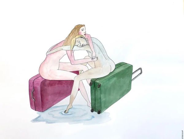
painting, watercolor
#
portrait
#
painting
#
figuration
#
watercolor
#
genre-painting
#
erotic-art
#
realism
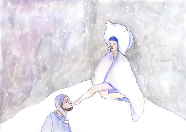
Copyright: Kinder Album,Fair Use
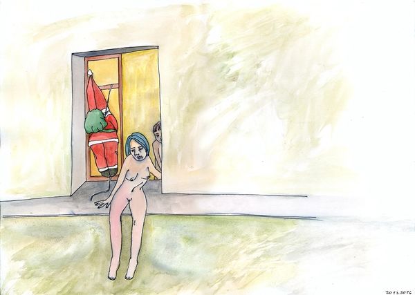
This untitled image was made by Kinder Album in 2020, seemingly with watercolour. What strikes me about this image is the stark contrast between the soft, diffused colours and the bold, definite lines. The way the watercolour bleeds and blends gives the image a dreamlike quality, while the outlines keep it grounded in reality. The blanket, for instance, is rendered with washes of blue that fade into white, creating a sense of depth and texture. Look at the way the pigment settles at the edges of the folds – you can almost feel the weight of the fabric. Then there's Santa, slumped in his chair, his red suit rendered in similar loose washes of pigment. It's that bright red, contrasted with the pastels of the bed that really catches your eye. You know, it reminds me a little of David Hockney's more illustrative works. Both artists have a knack for capturing a moment with just a few well-placed lines and washes of colour, leaving you to fill in the gaps. Art is all about these conversations, echoes, and reinterpretations, isn't it?
Comments
No comments
Be the first to comment and join the conversation on the ultimate creative platform.
More like this