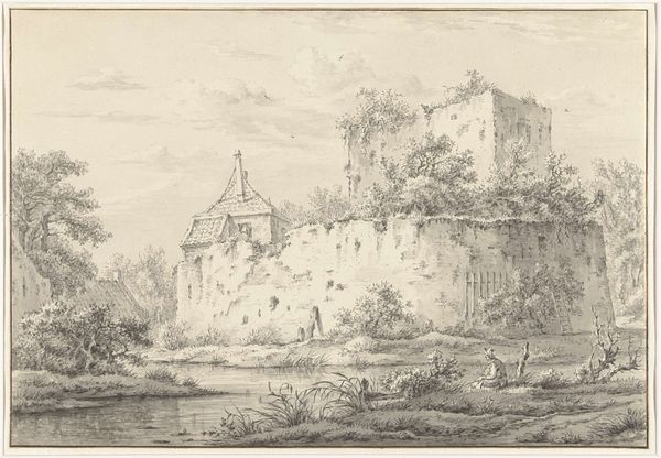
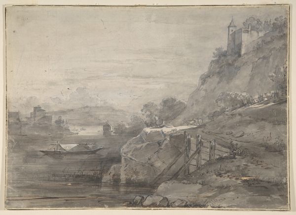
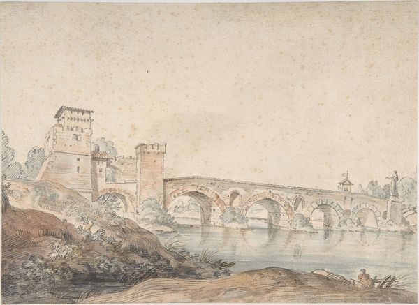
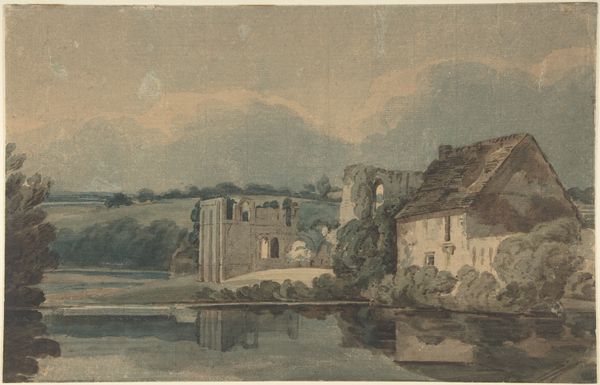
Riviergezicht met boogbrug en fortificaties op de rechteroever 1820 - 1896
0:00
0:00
kasparuskarsen
Rijksmuseum
Dimensions: height 135 mm, width 213 mm
Copyright: Rijks Museum: Open Domain
Curator: Let's turn our attention to this intriguing cityscape, “River View with an Arched Bridge and Fortifications on the Right Bank,” by Kasparus Karsen, likely created sometime between 1820 and 1896. It's currently held at the Rijksmuseum. Editor: Immediately, the monochrome palette strikes me – primarily shades of gray and brown – lending it a sense of timelessness. There’s an interesting interplay between the vertical thrust of the tower and fortress and the horizontal lines of the bridge and river. It feels both grounded and aspiring. Curator: The artist captures the burgeoning sense of national identity so common in 19th-century Holland, particularly through his interest in representing architectural landmarks. Think about how the fortications would act as symbols of civic and military strength at a time of great societal upheaval. Editor: Indeed. And Karsen uses the watercolour medium deftly to suggest the textures of stone and water. See how the reflected images in the water become wonderfully abstracted. It’s this flattening, playing with reflections, that keeps drawing my eye, adding another plane and dimension that questions conventional representation. Curator: Right, and you can imagine how crucial drawings like this were for popularizing a collective memory or shared sense of place within Dutch society. Watercolors like this, distributed widely, served as visual documents that solidified a community's identity around its iconic structures and landmarks. Editor: Notice also how the architectural forms, the fortress, the tower, are carefully delineated, their geometries are well defined against the backdrop of an atmospheric sky, yet even within a fairly constrained composition the eye never fails to recognize form and function of the composition. Curator: Karsen’s skill lies not only in architectural accuracy, but in harnessing Romantic sensibilities toward an expression of Dutch identity and historical continuity. This becomes visible when we contextualize the painting in the setting of a society trying to solidify its own narrative. Editor: Considering the materials -- pencil, watercolor, and paper -- they almost add another textural element to the work which would contribute to its authenticity. For all of its focus on historical architecture, the translucency of the watercolor makes this, in many ways, a work on light and visual impression as well. Curator: I agree entirely, it is that perfect balance between meticulous observation and a gentle, almost wistful touch, and as much about place and history, as it is about the possibilities inherent to watercolor. Editor: This has given me new thoughts and perspectives regarding color values, how form and medium complement each other while rendering a timeless image of resilience.
Comments
No comments
Be the first to comment and join the conversation on the ultimate creative platform.
More like this