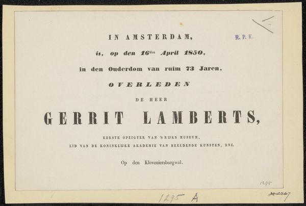
Titelpagina voor: Joost van den Vondel, Gysbrecht van Aemstel, treurspel, 1841 before 1841
0:00
0:00
charlesrochussen
Rijksmuseum
graphic-art, print, typography
#
graphic-art
#
dutch-golden-age
# print
#
typography
Dimensions: height 270 mm, width 331 mm
Copyright: Rijks Museum: Open Domain
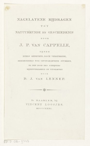
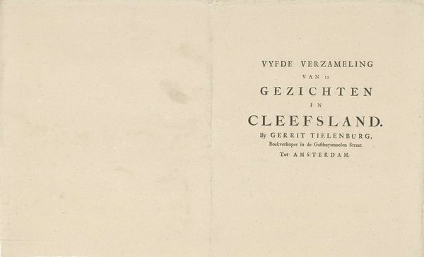
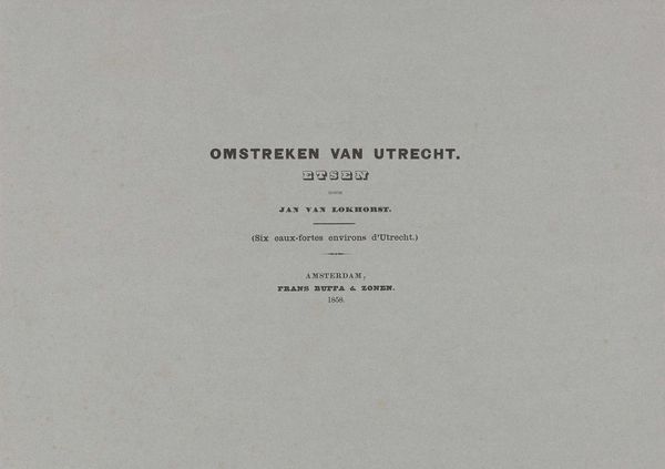
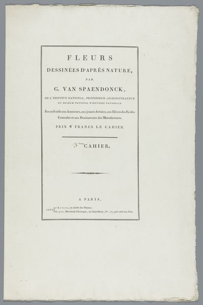
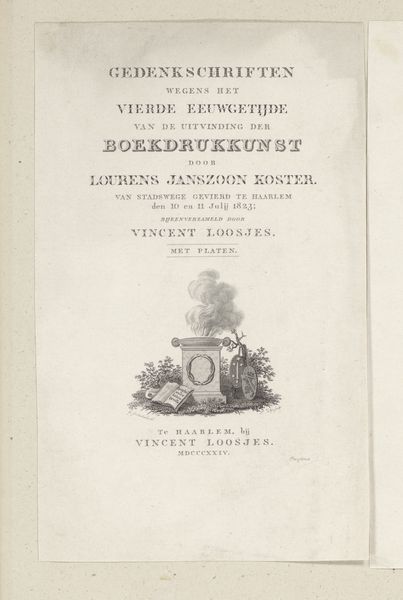
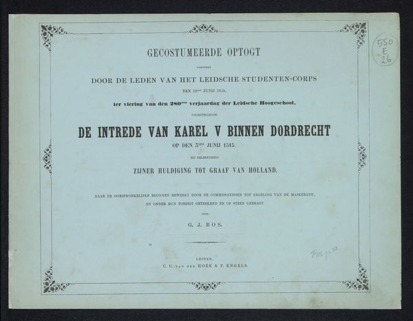
Editor: This is the title page for *Gysbrecht van Aemstel, treurspel* (a tragedy) from before 1841. The play is by Joost van den Vondel and illustrated by Charles Rochussen. It's a print with typography held in the Rijksmuseum. Initially, it appears quite simple and direct. What catches your eye in this piece? Curator: As an iconographer, my attention is drawn to how the title itself, rendered in a specific typeface, functions as a symbol. Think about how fonts carry weight, history, and intended audience. This typeface suggests a formality and connection to a literary tradition, almost like a coat of arms for the play itself. What cultural memories does the typography evoke for you? Editor: I suppose it makes me think of old playbills or announcements, something very official. Do you think the choice of typeface was intended to lend the play authority? Curator: Absolutely. It’s intended to signal prestige. It is like visual rhetoric. The arrangement and weight of the words draw your eye in a deliberate way, don’t you think? Also consider the function of a title page - it acts as a gateway, inviting the viewer into the world of the play. The typography then functions almost like a portal through language, guiding the audience's interpretation. It acts as a container for memory, for a shared cultural past that is activated with each reading. Editor: I never really thought of typography in such depth! I will remember that the letters can communicate in ways beyond their basic definitions. Curator: And also understand that visual symbolism is not arbitrary, but the accumulation of collective history and intent. A wonderful thought.
Comments
No comments
Be the first to comment and join the conversation on the ultimate creative platform.
