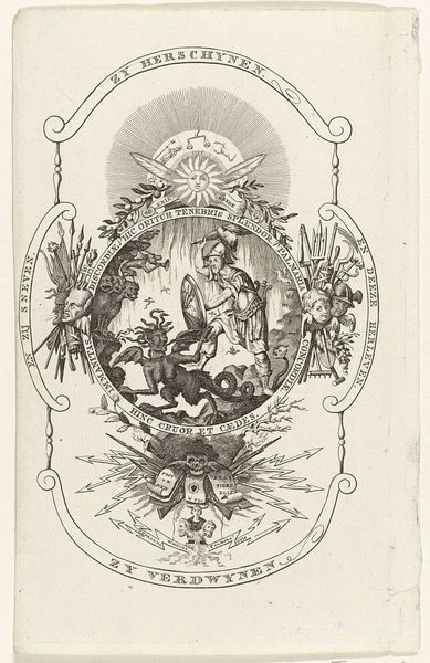
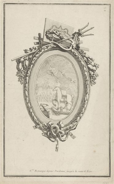
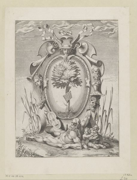
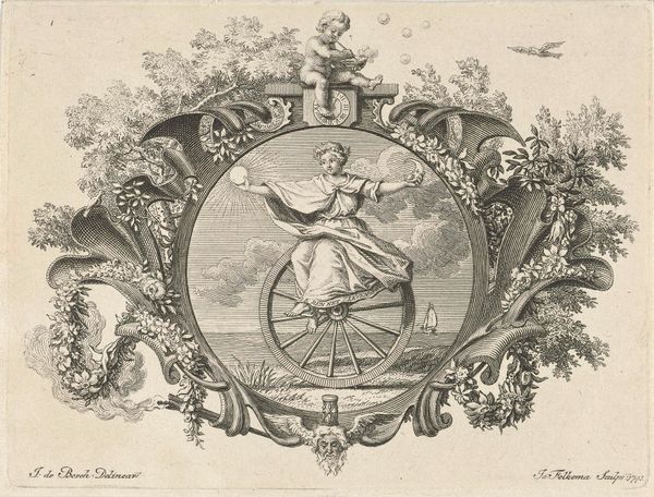
Embleem van het Rotterdams exercitiegenootschap De Palmboom, 1785. 1785
0:00
0:00
drawing, etching, paper, ink
#
drawing
#
neoclacissism
#
allegory
#
etching
#
paper
#
form
#
ink
#
line
#
history-painting
Dimensions: height 225 mm, width 169 mm
Copyright: Rijks Museum: Open Domain
Editor: This is the "Embleem van het Rotterdams exercitiegenootschap De Palmboom, 1785," by Dirk Langendijk, a drawing in ink using etching on paper. The monochrome palette creates a stark, somewhat ominous feeling. What formal elements strike you most about this piece? Curator: The linework is particularly noteworthy, Editor. Langendijk employs it meticulously to define form and create subtle tonal gradations. Observe the contrast between the tightly rendered palm fronds and the more loosely defined clouds. This deliberate contrast accentuates the emblem's central position. The oval composition too, draws the eye, don't you think? Editor: Yes, definitely. I hadn't thought about how the line quality emphasizes certain elements. The composition in the oval feels almost like a world within a world. Curator: Precisely. Note also the balance achieved. The ribbon at the top mirrors the cloud formation at the base, creating a visual anchor. How does the symmetrical composition create visual tension? Editor: Well, although the clouds and ribbon mirror each other, they aren't identical. The asymmetry feels very intentional and that it enlivens what might otherwise be static. Curator: A fine observation. These visual variations within a symmetrical structure establish dynamism and visual complexity. What, would you say, that the style achieves beyond merely representing a scene? Editor: That makes a lot of sense when I look at it more closely. I initially thought it looked unbalanced because of the bright lighting. It feels a bit like the start of a thunderstorm. I notice also the edges around the object are equally lit, perhaps to bring greater focus to what the work is an "embleem" of. Curator: Exactly, you can see how the formal aspects work towards emphasis and dynamism! Focusing on composition is essential when we examine emblems of groups. Editor: Thank you. Thinking about the relationship between form and intention in this has changed how I see the work.
Comments
No comments
Be the first to comment and join the conversation on the ultimate creative platform.
More like this