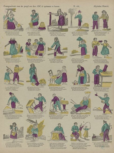
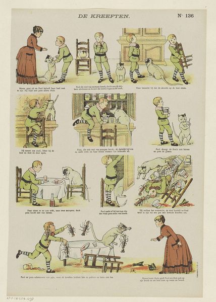
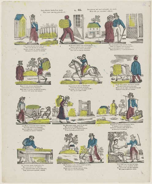
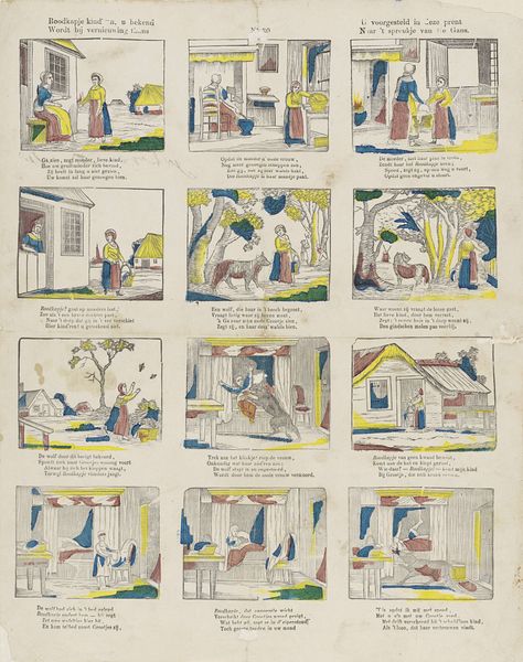
Droevige gevolgen der luiheid / Tristes suites de la paresse 1800 - 1833
0:00
0:00
philippusjacobusbrepols
Rijksmuseum
lithograph, print
#
narrative-art
#
dutch-golden-age
#
lithograph
# print
#
caricature
#
figuration
#
child
#
folk-art
#
comic
#
watercolour illustration
#
genre-painting
Dimensions: height 371 mm, width 306 mm
Copyright: Rijks Museum: Open Domain
Editor: This is "Droevige gevolgen der luiheid / Tristes suites de la paresse," or "Sad Consequences of Laziness," a lithograph by Philippus Jacobus Brepols, created sometime between 1800 and 1833. It's divided into these little scenes, almost like a comic strip. There's a slightly unsettling, didactic feel to the whole thing. How would you interpret this work? Curator: I would argue that the sequential arrangement directs our eye according to a pre-established semiotic order, which we ought to unpack to discern its logic. What organizing structural principle underlies these variations? Do you see any repeated formal element across the images? Editor: Well, the figure of the boy appears in almost every panel. And the colour palette is quite consistent too - mainly greens and purples. It has a limited colour space. Curator: Precisely! Brepols strategically limits chromatic differentiation, creating a coherent visual syntax across the narrative. Consider also the relation between foreground and background within each miniature tableau. Are we looking at a deliberate flattening of perspective? Editor: Yes, everything feels quite two-dimensional. It is more about representing an idea, and less about imitating reality. Curator: The reduction of spatial depth draws our attention away from illusionistic representation and instead directs it toward a more graphic form. A strategic deployment of a visual code of form, in the style of its semiotic register? Editor: Interesting! I hadn't thought about it that way. Focusing on these elements really shows how much control the artist had over the storytelling. Curator: Indeed, Brepols utilizes the basic elements of the visual language - line, form, colour, space - to formulate a complete narrative. These are structured to serve not just decorative purpose, but ideological instruction. Editor: Right. I definitely see this print in a completely different light now. It's more than just a simple moral story.
Comments
No comments
Be the first to comment and join the conversation on the ultimate creative platform.
More like this