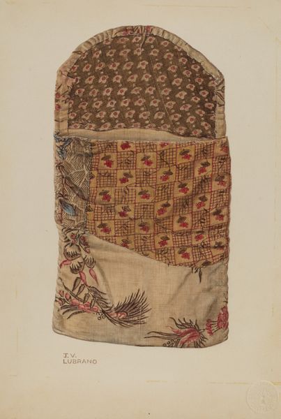
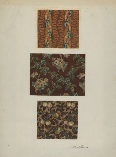
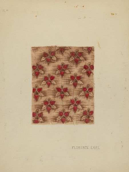
drawing, coloured-pencil, watercolor
#
drawing
#
coloured-pencil
#
water colours
#
watercolor
#
coloured pencil
#
academic-art
#
watercolor
#
realism
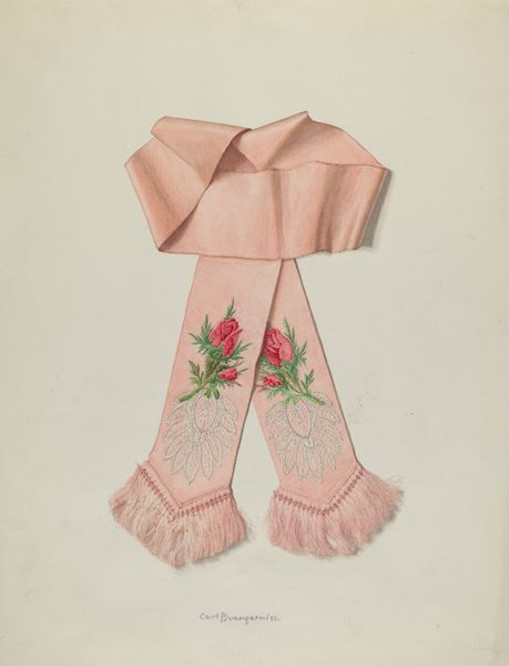
Dimensions: overall: 46.9 x 35.4 cm (18 7/16 x 13 15/16 in.) Original IAD Object: 56" wide; 46" long
Copyright: National Gallery of Art: CC0 1.0
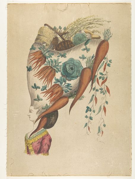
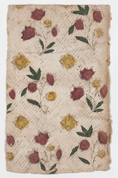
Curator: Well, this piece feels quite understated. It’s titled “Piano Cover” and believed to be created around 1940 by Carl Buergerniss. The artwork combines drawing and watercolor with coloured-pencil detailing to depict, as the title suggests, a piano cover. It is a rather humble subject for an artist to choose. Editor: It is modest. My first impression is that it seems a bit forlorn, suspended against the stark white background. Is it just me, or is there a sense of fading beauty here? The colors are muted, and you can see a bit of damage in the upper corner. The overall effect, especially given its domestic subject, speaks of the ephemerality of comfort and the passing of time. Curator: That's an interesting point. Given the period – the 1940s – and without knowing for sure why this was made, it might hint at themes of loss during a period of worldwide turmoil. The image has some pretty striking symbols and recurring figures that must come into play when deciphering meaning. Editor: Absolutely. What's fascinating is how the almost stylized lotus flower pattern along the edge seems at odds with the more realist treatment of the cloth. To me, it echoes the symbolic language often employed in textile art. Flowers equal beauty, domesticity, fleeting moments of pleasure. This cover likely represented something cherished within a home during a hard time. Curator: It is precisely this subtle tension that interests me. The work hovers somewhere between objective representation and stylized emblem, with both working to convey multiple messages and moods. The placement of loose flora also amplifies some feeling of "scatteredness," no? Like musical notes, or moments fading. Editor: Perhaps this placement references earlier 20th century trends toward abstraction within visual language, mirroring what was happening with sound around the world. You know, it's making me reflect on the changing roles of women during that period, with more women finding employment as social structures adapted to wartime conditions. This piano cover perhaps points to the fragility of that fleeting moment, of domestic peace under threat. Curator: That perspective resonates deeply. Considering its time and execution, “Piano Cover” functions beyond mere decoration; it is a document filled with domestic echoes of national experiences. Its unassuming subject and refined visual language speak volumes about resilience during uncertain times. Editor: Absolutely. A seemingly simple image but one brimming with the social context, historical memory, and emotional depth of the era. A little object lesson in not overlooking humble images as meaningful carriers of personal history.
Comments
No comments
Be the first to comment and join the conversation on the ultimate creative platform.
More like this