drawing, paper, ink, pen
#
portrait
#
drawing
#
paper
#
ink
#
intimism
#
calligraphic
#
pen work
#
pen
#
calligraphy
Copyright: Rijks Museum: Open Domain
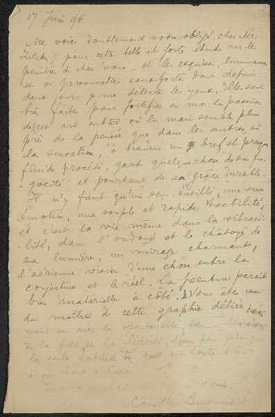
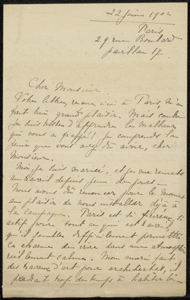
Curator: This is "Brief aan Philip Zilcken," believed to have been created sometime between 1911 and 1916 by M. Botkine. It’s rendered in ink on paper. Editor: It has a beautiful intimacy. Even though it's just script, the fluid lines of the handwriting have such a personal feel, almost like a portrait of the writer himself. Curator: Precisely. The intimacy aligns perfectly with the principles of Intimism, a post-Impressionist movement that really honed in on domestic scenes and personal moments. Note the economy of line, a drawing reduced to its most essential elements. Editor: The writing, of course, adds layers. The letter seems to concern information about a painter named Pelopoff… it’s like peering into a forgotten exchange. There’s a wistful feeling, amplified by the faded ink and fragile paper. Curator: That melancholic mood you perceive stems from the very construction of the drawing itself. Observe the consistent stroke weight, almost like musical notation giving it structural rhythm, which further enhances the emotional tone of a correspondence which speaks of not being able to give any information. Editor: So, it’s the combination of these objective formal components creates and reinforces the overall impression? That resonates deeply. Even though the letter's contents are mundane, it functions like a vessel holding a whole bygone era. You get a feeling that those squiggles and swirls would mean a lot to both author and recipient, and a little to anyone finding the artwork. Curator: Precisely, it is a work whose structure transcends the simple communication of everyday activity and moves into art. Editor: Thank you, Curator. I can't look at handwritten documents the same way now. I can imagine seeing the humanity and cultural memory contained in marks of the hand in artworks like this from now on.
Comments
No comments
Be the first to comment and join the conversation on the ultimate creative platform.
More like this