graphic-art, print, typography
#
graphic-art
#
type repetition
#
limitedcolor palette
#
cold feature colours
#
reduced colour palette
# print
#
woodcut effect
#
paper texture
#
typography
#
geometric
#
letter design
#
folded paper
#
embossed
#
line
#
decorative-art
#
foil embossing
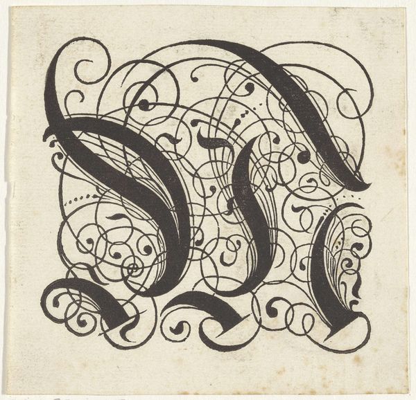
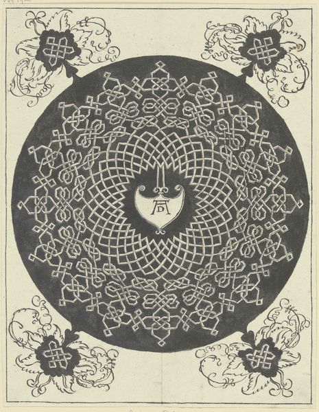
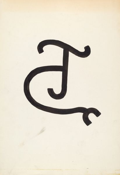
Dimensions: height 104 mm, width 85 mm
Copyright: Rijks Museum: Open Domain
Reinier Willem Petrus de Vries made this monogram for C. Schillemans with ink on paper, and I love that it feels both ancient and modern. It’s as if a calligrapher from the middle ages started experimenting with op-art. The process seems so straightforward - black ink applied to create a cursive ‘S’ which has been punctuated with carefully placed dots. The density and opacity of the black ink are so complete that the letterform appears solid and imposing. The paper peeks through in tiny spots around the edges of the form, revealing the artist's hand, their focus and the simple tools that they used. I find myself thinking about artists like Hilma af Klint, who also explored the relationship between abstract forms and spiritual ideas. Like Hilma, De Vries’s work invites us to contemplate the hidden meanings and symbolic potential of simple forms. It feels open, like it's part of an ongoing conversation.
Comments
No comments
Be the first to comment and join the conversation on the ultimate creative platform.
More like this