print, typography, poster
# print
#
typography
#
poster
#
modernism
Copyright: Rijks Museum: Open Domain
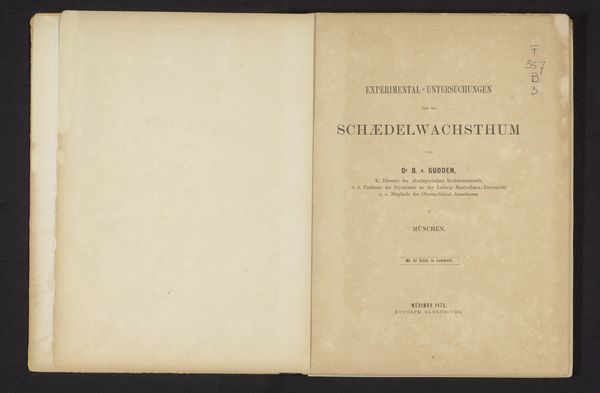
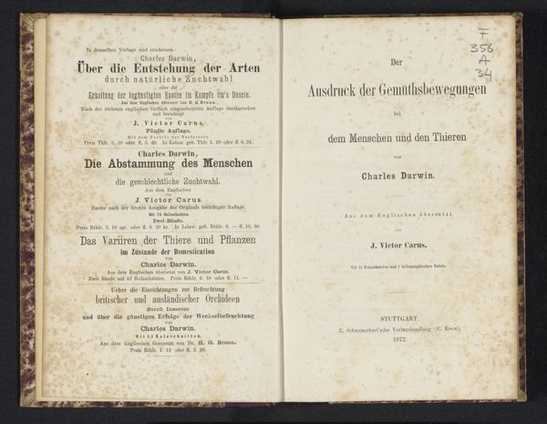
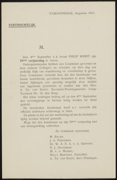
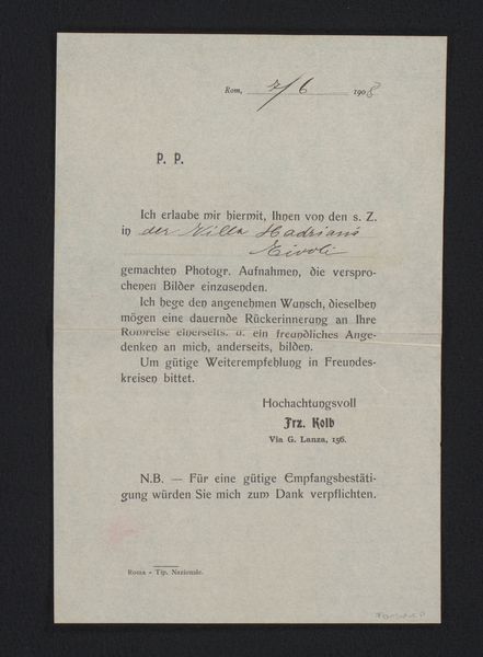
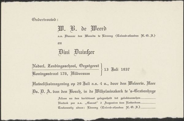
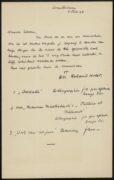
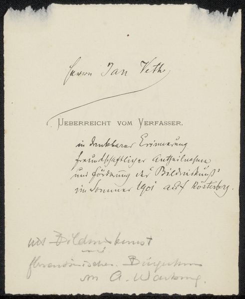
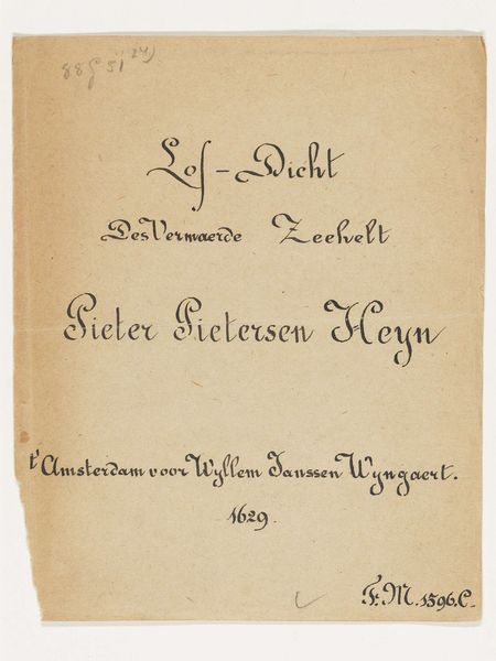
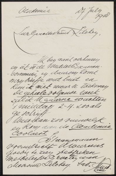
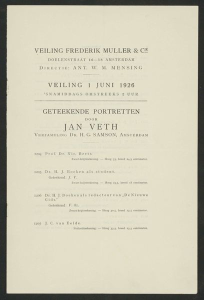
This is a page from an exhibition catalogue, likely printed in 1910. At first glance, the arrangement of text creates a stark, yet ordered composition. The page’s design is structured by columns of text. Note the hierarchy established through varying font sizes and weights. The word "CATALOGUS" dominates, immediately informing the viewer of the document's purpose. Below this, the structured list of artists and artworks suggests a systematic approach to organizing and presenting information. The handwritten annotations introduce an element of disruption and a sense of personal interaction. The annotations challenge the supposed objectivity of the catalogue, layering subjective commentary over its structured format. This play between order and disorder invites contemplation of the artwork's reception and its dialogue with the viewer. It prompts us to consider how such documents shape our understanding and valuation of art.
Comments
No comments
Be the first to comment and join the conversation on the ultimate creative platform.
