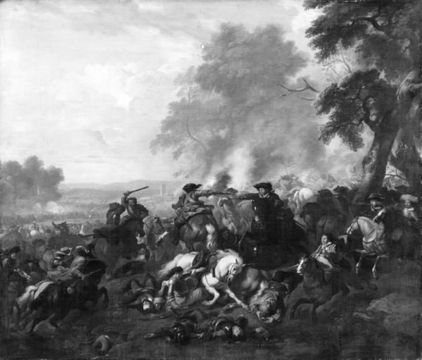
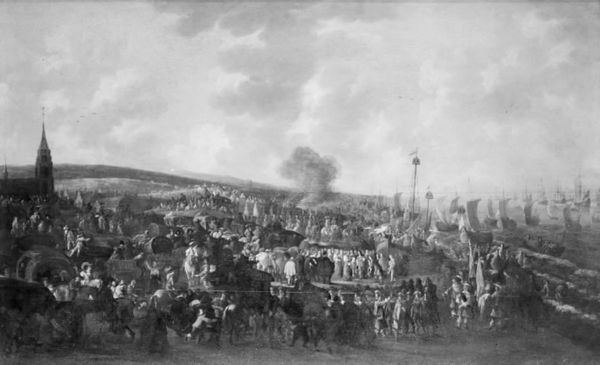
Dimensions: 100 cm (height) x 151.5 cm (width) (Netto)
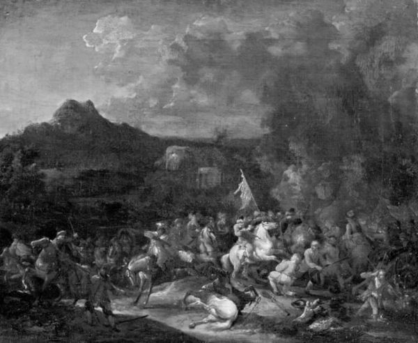
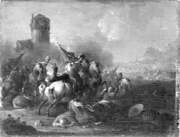
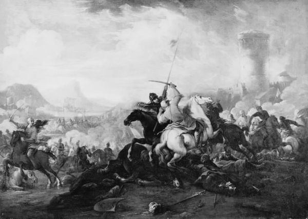
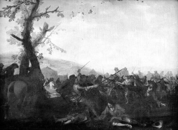
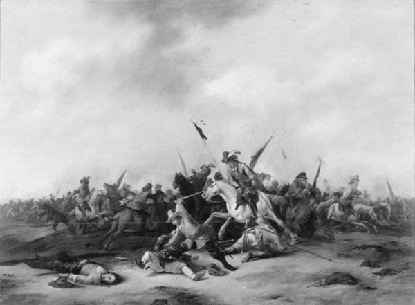
Curator: My first thought? Chaos. Utter and complete chaos rendered in shades of grey. It's overwhelming, isn't it? Editor: Yes, a whirlwind of conflicting movement, visually. We're looking at a painting identified as “A Battle,” dating from 1724-1827 and created by KMS Spengler 505, also known as Monogrammist PW. The canvas is held here at the SMK, Statens Museum for Kunst. Curator: Wow, that's a long dating period. Makes me wonder what the artist was doing in between… probably more battles. And, is it just me, or is it almost comforting? I mean, yes, there’s fighting, but it feels... distant. Dreamlike, maybe. Editor: The composition certainly directs the eye. Note the division of space: the foreground is crowded, intense, dominated by dark tones, then it leads the gaze toward the smoky, lighter distance with almost pastoral elements on the left horizon. The diagonals imply action but the monochromatic palette drains away color contrast as narrative anchor. Curator: So, it's a battle, but also a landscape? That feels contradictory. Like the artist is saying, "Here's the awfulness of war, but hey, look at that nice mountain!" Which, I guess, is kind of how life is sometimes. There's horror, and then there’s just... Tuesday. Editor: Formally, yes. The blending of Baroque dramatic elements and nascent Realism adds a unique dimension. Look at the rendering of the horses. Or even that upturned white object in the very front! Realism’s nascent truth to observable detail intersects Baroque dynamism and composition. It invites questioning of idealized notions of heroic battle narrative. Curator: I didn't notice that… What is it? A hat? A bowl? It feels so out of place, almost comical amid all this. That, for me, is where the art really starts to happen, when the strangeness makes you look twice. It shakes your faith in the seriousness of things. Editor: Indeed. In its juxtapositions, perhaps this ‘Battle’ serves less as documentation and functions best as a subtle visual essay about history, violence, and distanced perspective. Curator: So it looks like chaos on the surface but hides thoughtful commentary. Fascinating, I definitely won't see just shades of grey again. Editor: Agreed. Let's move along; there’s much more to uncover!
Comments
No comments
Be the first to comment and join the conversation on the ultimate creative platform.
More like this