Copyright: Modern Artists: Artvee
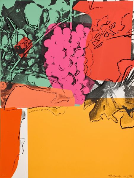
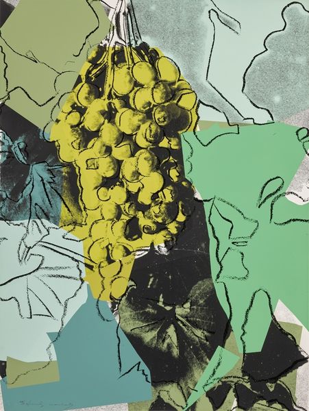
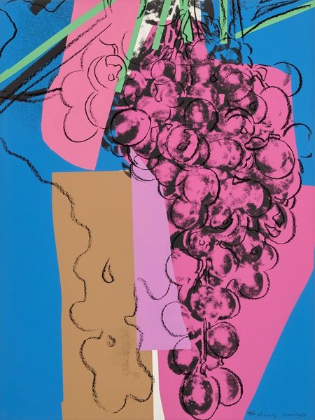
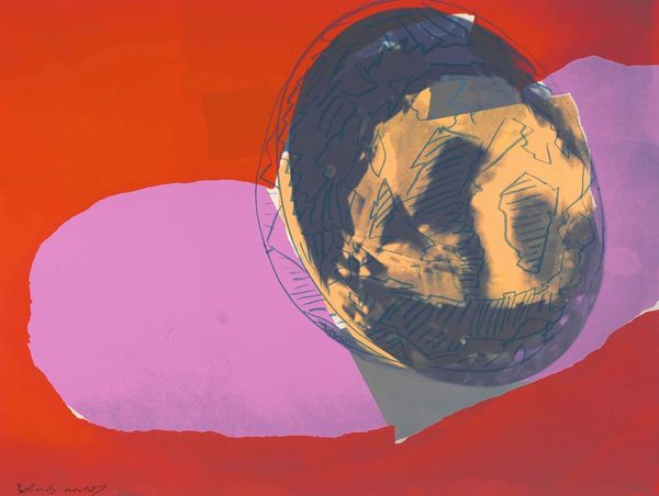
Andy Warhol made this screenprint, Grapes #2, with ink on paper. See how the bold colors sit next to each other, like puzzle pieces? It's a process of layering, of building up the image from simple shapes and lines. Warhol’s colors are so vibrant, aren't they? The electric blue of the grapes against the flat purple, the chartreuse. It's like he's not just showing us grapes, but the idea of grapes, a pop-art version of abundance. The black outlines give it a graphic punch, like a comic book panel. Notice how some edges are sharp, others are smudged? It's like he's playing with the idea of perfection, letting the process show, the little mistakes, the human touch. Thinking about someone like Matisse, maybe, in the way Warhol simplifies form and cranks up the color. But where Matisse feels sensual, Warhol feels… cooler, more detached. Still, there’s an energy in the push and pull of the colors. Art's not about answers, it's about asking questions and keeping the conversation going.
Comments
No comments
Be the first to comment and join the conversation on the ultimate creative platform.
More like this