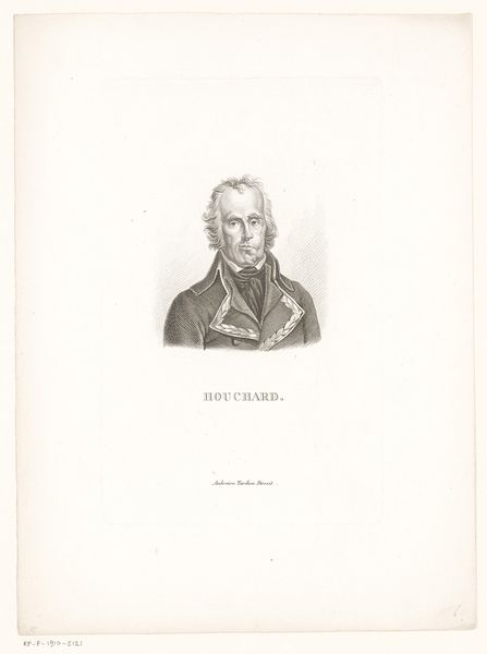
print, engraving
#
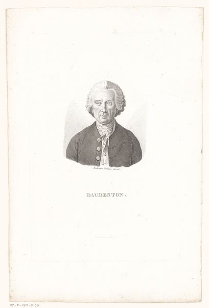
portrait
#
neoclacissism
# print
#
old engraving style
#
history-painting
#
engraving
Dimensions: height 212 mm, width 138 mm
Copyright: Rijks Museum: Open Domain
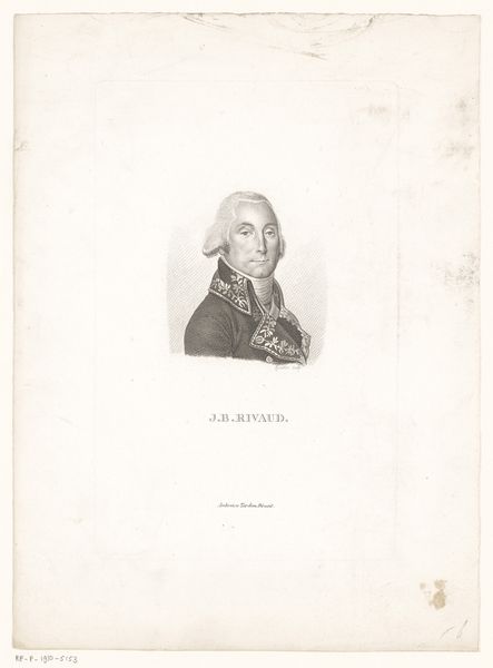
Curator: Take a look at this finely rendered engraving, created circa 1818 by Charles Aimé Forestier. It's titled "Portret van Jean-Charles Pichegru," depicting the French general. Editor: Hmm, imposing! The fellow looks every bit the serious military type. Austere. Like he's permanently waiting for bad news, despite that bit of powdered hair trying for a flourish. Curator: The portrait definitely captures the Neoclassical aesthetic. Look at the emphasis on clean lines, rational composition, and how the artist employed a somewhat cool, restrained emotional tone. These were hallmarks of the era, particularly in portraiture designed to convey a sense of order and authority. Editor: Cool and restrained alright, though those chevron details all over his jacket and collar feel kind of like he’s been caught in a knitting mishap. All that zig-zag action undercuts any impression of warmth. It gives a sort of frantic energy under the official demeanor, maybe he’s a schemer? Curator: That might be pushing it! Although printmaking allowed for dissemination and wider visibility, engraved portraits were important tools for shaping public perceptions of important people, as it emphasizes a general's strength. Editor: Shaped or flattened! It does sort of sanitize away personality though. Like they sanded away all the interesting bits, all the humanity until there's only heroic… outline. Even though the details are gorgeous, don't get me wrong. You can almost feel the linen of his jacket through the image, the weight of that fabric, and that's remarkable in a way. Curator: Agreed. It provides insight into how society wanted to immortalize individuals they deemed noteworthy. Pichegru had a complex history, oscillating between triumph and allegations of treason, which makes the composition a little...complicated. Editor: Ah, a troubled soul wearing too many zigzags, preserved for eternity. What better image for a complicated man, really? Maybe the coldness of the image adds layers instead of diminishing him after all... Curator: An excellent point, prompting reflection on permanence. Editor: And how easy it is to leave the zig-zags and start perceiving shapes, the outline of the person inside. Let’s keep walking?
Comments
No comments
Be the first to comment and join the conversation on the ultimate creative platform.
More like this