Copyright: CC0 1.0
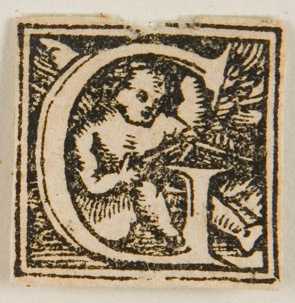
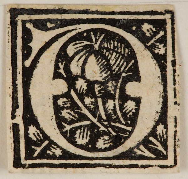
Editor: This is an anonymous woodcut called "Initial G" from the Harvard Art Museums. It's quite small and intricate. What strikes me most is the stark contrast between the white letterform and the dense black lines surrounding it. What do you make of the composition? Curator: Notice how the anonymous artist uses the black lines to define not only the perimeter, but also to create depth and texture within the "G" itself. The contrast isn't just stark; it's strategic, guiding the eye. Consider the placement of figures within the letterform—how does their arrangement impact the overall balance? Editor: I see what you mean! The figures seem deliberately positioned to fill the space. It really makes you look closely at the relationship between form and content. Curator: Precisely. Through the skillful manipulation of line and form, the artist elevates a simple letter into a complex visual statement. Editor: That’s a great point; I hadn’t considered it that way. Thanks!
Comments
No comments
Be the first to comment and join the conversation on the ultimate creative platform.
More like this