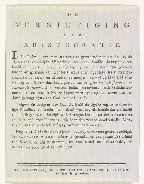
Titelprent voor de serie handtekeningen van de leden van de Vergadering der Aanzienlijken, 1814 1814
0:00
0:00
graphic-art, print, typography, engraving
#
script typeface
#
graphic-art
#
script typography
# print
#
old engraving style
#
hand drawn type
#
typography
#
hand-drawn typeface
#
stylized text
#
thick font
#
golden font
#
classical type
#
engraving
#
historical font
Dimensions: height 248 mm, width 595 mm
Copyright: Rijks Museum: Open Domain
Editor: So, this is the title page for the series of signatures from the Assembly of Notables, created in 1814 by Cornelis van Baarsel. It's a print, an engraving, entirely typographic. I’m struck by its formality and almost austere presentation. What feelings does this provoke in you? Curator: You know, it whispers of a very particular moment in time. Think about it – 1814. Napoleon’s star is falling, Europe is redrawing its map, and this engraving documents the signatures of Dutch dignitaries deciding on a constitution for the “United Netherlands.” It’s fascinating that typography can convey such weight, don't you think? Editor: Absolutely. The hand-drawn type adds character to its historical value. But is that all it is—historical? Does the piece communicate more? Curator: For me, it transcends pure function. Notice how the varying font sizes create a visual hierarchy. The eye dances across the page, guided by Baarsel’s deliberate choices. The phrase "Vereenigde Nederlanden," "United Netherlands," is emblazoned like a promise…or perhaps a fragile hope. Do you feel the optimism in it? Editor: I can see it now, the promise and the fragility you mention. Initially, I only saw the stiff formality. But I hadn't considered how the typography subtly expresses the cultural context, and those hidden emotions underneath. Curator: And isn't that the magic of art? To unearth the layers hidden beneath the surface, until the feelings shimmer and beckon! Editor: Absolutely! Thanks, I will consider more often how typeface choices influence our reading of a piece, even one like this.
Comments
No comments
Be the first to comment and join the conversation on the ultimate creative platform.
More like this