Dimensions: overall: 65.4 x 81.1 cm (25 3/4 x 31 15/16 in.) framed: 85.1 x 100 x 5.7 cm (33 1/2 x 39 3/8 x 2 1/4 in.)
Copyright: National Gallery of Art: CC0 1.0
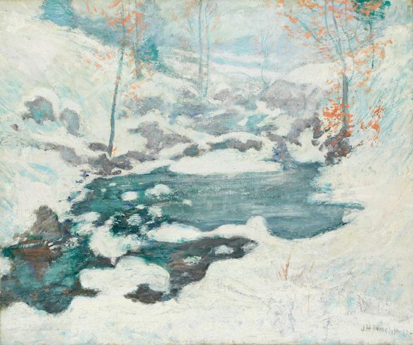
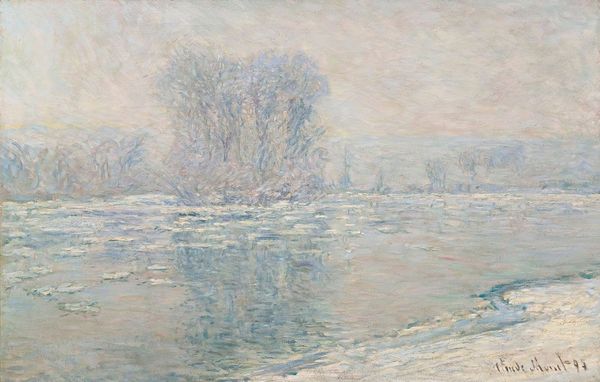
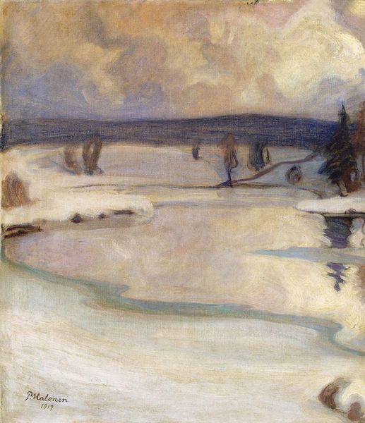
Curator: What strikes me immediately about John Henry Twachtman's "Winter Harmony," dating circa 1890-1900, is its masterful use of watercolor to evoke such a quiet, almost ethereal landscape. Editor: There’s something captivating about its process and composition. It reminds me of textiles, maybe the weft and warp. The varying layers of color, they give it depth. Like the terrain, that little bit of a hill next to the stream of water there. A skilled practice and handling of a material that gives a quiet mood. Curator: Absolutely, and in understanding the sociopolitical context, remember the late 19th century’s fascination with capturing fleeting moments and nature's moods. Twachtman situates himself in this moment, reflecting a broader turn-of-the-century feeling of environmental fragility amidst increasing industrialization. His soft hues speak volumes. We should ask ourselves, how did this aesthetic move influence the politics of his time? Editor: Well, looking at materiality, he really seemed to be taking this Impressionist ethos directly out into nature. And watercolors allowed him the portability, the swift capture needed for plein-air painting. What I think is crucial about an artist selecting to paint in plain air is a relationship between themselves and their environments. Twachtman then seems so deeply, physically connected to his environments, which lends the scene its depth. Curator: Precisely. Beyond just a visual rendering, consider how Twachtman's "Winter Harmony" invites contemplation on themes of time, loss, and even societal anxieties reflected in the desolate, serene landscape. It asks, how can this tranquility become an activist tool, urging us to reconsider our destructive trajectories? How does the whiteness interact with concepts of erasure and marginalization in art history? Editor: Right, it's all intertwined. Looking at watercolors, that it's thought of in terms of being a lesser material or form compared to oils. This kind of speaks to how people understand skill, the amount of material available for use, and labor in terms of time or skill. This piece questions this binary because Twachtman creates incredible textures from seemingly nothing with this more economical medium. Curator: That emphasis on material reality reshapes our view. It forces us to reconsider hierarchical values in art history and reflect on why certain artistic processes are more valued over others based on patriarchal values. It's as simple as understanding an artists own physical relationship and relationship to art in an activist practice that moves past purely the artist and their context to understand them. Editor: Indeed, appreciating "Winter Harmony" then is more than enjoying its aesthetic beauty. It's about interrogating its place within larger social, political and material constructs. It offers quiet provocation by its elegant method. Curator: So, the beauty is not an escape, but an entry point into these issues, demanding our engagement. Editor: It’s both harmonious and dissonant in terms of both its craft and how it asks you to observe.
Comments
No comments
Be the first to comment and join the conversation on the ultimate creative platform.
More like this