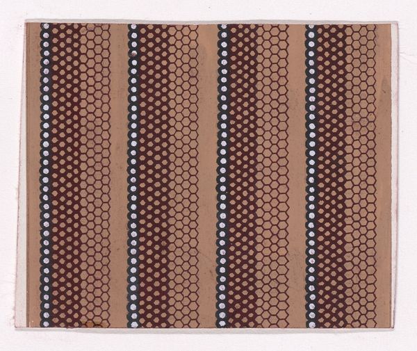
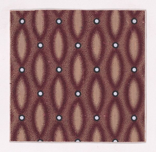
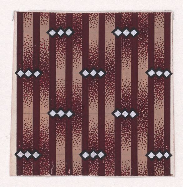
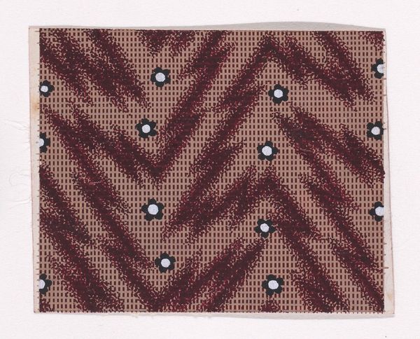
Textile Design with Vertical Stripes Decorated with Quatrefoils of Pearls and with Offsetting Honeycomb Patterns 1840
drawing, print
drawing
pattern
geometric pattern
geometric
Dimensions: Sheet: 2 13/16 × 3 1/16 in. (7.1 × 7.7 cm)
Copyright: Public Domain
Editor: Here we have an anonymous textile design from around 1840, a drawing and print on paper. It’s called “Textile Design with Vertical Stripes Decorated with Quatrefoils of Pearls and with Offsetting Honeycomb Patterns.” I find the tight repetition quite mesmerizing, but what do you see in its construction? Curator: Indeed. Let's analyze this piece from a purely formal perspective. Notice the strict verticality emphasized by the strong, dark bands. These create a rhythmic structure countered by the offsetting honeycomb ground. The quatrefoils, appearing as clusters, punctuate the vertical lines adding visual interest, preventing the eye from simply traveling up and down. Editor: It's interesting how the limited color palette—brown, tan, and white—actually enhances the impact of the pattern itself. Why do you think the artist chose such a restrained palette? Curator: The color serves the structure. By limiting the chromatic range, the focus shifts to the textures and relationships between the elements. Imagine this design in bright colors. It might become gaudy or distracting. Here, the subdued tones allow for a nuanced interplay between figure and ground, vertical and horizontal rhythms. What if, hypothetically, we remove all elements except the honeycomb, what changes in affect? Editor: If only the honeycomb pattern remained, the piece would likely flatten out and feel less dynamic. The contrast provided by the dark stripes and floral patterns introduces complexity and hierarchy to the design. Curator: Precisely. The strength of this piece resides not in any narrative content, but solely in the arrangement of line, form, and color to create visual interest and harmony. A successful formal exercise. Editor: This formal analysis has really opened my eyes to appreciating how all of the parts contribute to the overall visual effect. I'm inspired to consider color more intentionally in my work.
Comments
No comments
Be the first to comment and join the conversation on the ultimate creative platform.
More like this