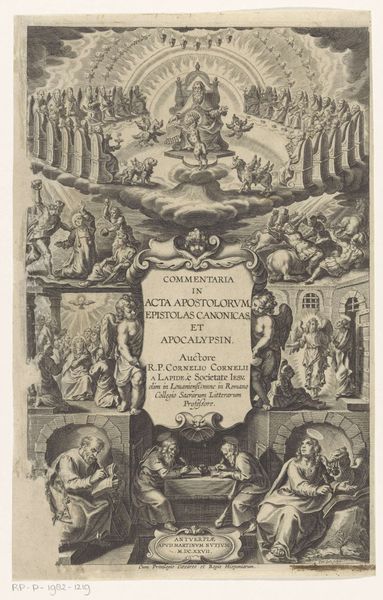
Titelpagina voor: Dat Nieuwe Testament ons liefs Heeren Iesu Christi, 1602 1602
jacobmatham
Rijksmuseum
graphic-art, print, paper, typography, ink, engraving
graphic-art
dutch-golden-age
paper
typography
ink
pen-ink sketch
northern-renaissance
engraving
Dimensions: height 181 mm, width 126 mm
Copyright: Rijks Museum: Open Domain
Editor: This is the title page for "Dat Nieuwe Testament ons liefs Heeren Iesu Christi," from 1602, by Jacob Matham. It's an engraving in ink on paper. It's fascinating how much detail he was able to achieve. It looks quite ornate; there's a lot to take in with all the lettering and decorative elements! How do you approach interpreting such a complex piece? Curator: Formally, one must begin by noting the emphasis on line. Matham exploits the graphic potential of the engraved line to create texture, depth, and delineate forms with a striking clarity. The typography itself, interwoven with the allegorical figures and architectural motifs, presents a sophisticated interplay between text and image. How does the distribution of light and shadow strike you? Editor: It seems quite even, actually, which contributes to the density of the composition. No single area really dominates visually, except perhaps the title itself. It’s like the busyness is the point. Curator: Precisely. The equilibrium in chiaroscuro fosters a sense of visual harmony, while the ornate bordering—complete with putti, hearts, and other symbolic imagery—suggests a self-contained symbolic program. What effect does the symmetrical layout of the engraving produce, in your estimation? Editor: I see your point. The bilateral symmetry lends a sense of formality and balance to the work. I was initially focused on the detail, but it's really held together as a unit. Curator: The unity is undeniable, which in turn lends credence to a divine origin for the depicted writing within. Symmetry equals perfect proportion, divine influence. Considering how Matham merges textual and figurative forms, the composition invites a prolonged study of the sacred space of the written word made artwork. I learned how all of the elements point toward God and perfection through art. Editor: I didn't notice the sense of balance initially; I can leave with an interest in typography and design in early printing.
Comments
No comments
Be the first to comment and join the conversation on the ultimate creative platform.