graphic-art, print, typography
#
graphic-art
#
art-nouveau
# print
#
typography
#
geometric
#
line
#
decorative-art
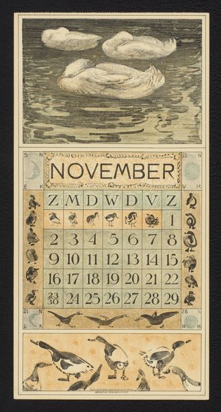
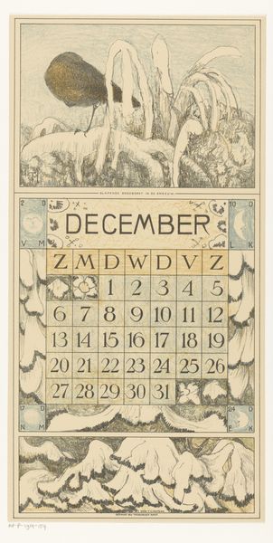
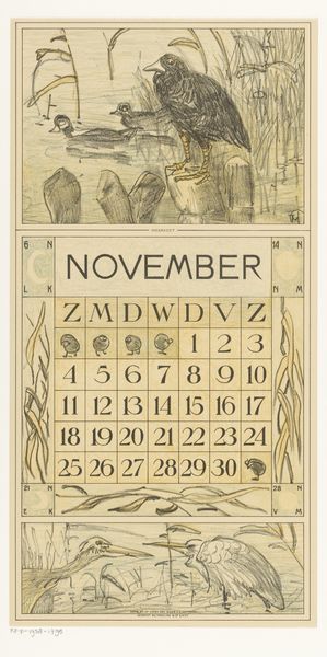
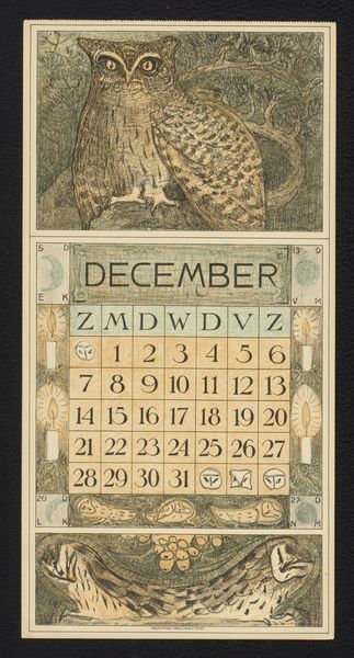
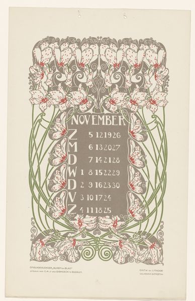
Dimensions: height 244 mm, width 175 mm
Copyright: Rijks Museum: Open Domain
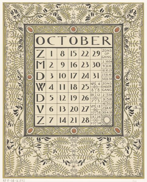
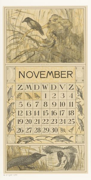
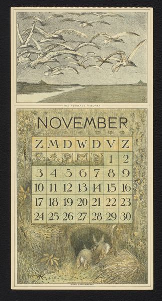
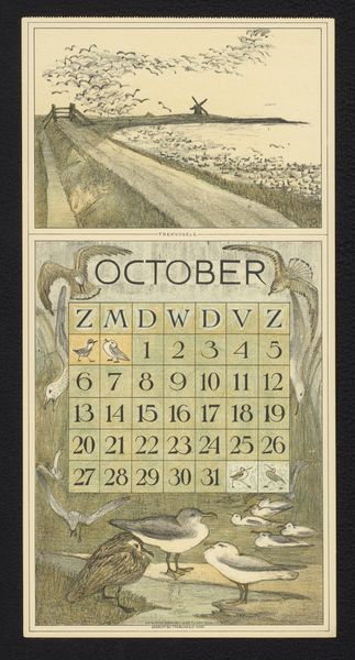
Editor: Here we have "Kalenderblad november 1900" created in 1900 by Carel Adolph Lion Cachet, housed in the Rijksmuseum. It looks like a print, maybe some kind of graphic art piece with typography. It has these fantastic geometric patterns and lines. I'm struck by how the design manages to be both functional and aesthetically decorative. What catches your eye in this work? Curator: Immediately, the interplay of line, form, and space asserts itself. Consider the deliberate articulation of geometric motifs against the representational function of the calendar. Note how the artist utilizes line—thick and assertive in places, delicate and intricate in others—to delineate form and create visual interest. Editor: I see what you mean, there's this real tension between the abstract decorative elements and the practical purpose of a calendar. What about the use of color? Curator: Indeed. The limited color palette—earthy tones of black, orange and green—functions less to imitate nature and more to structure the visual field. Do the colors delineate specific content, would you say, or more provide a rhythmic pulse to the whole composition? Editor: I think they highlight the different visual planes, adding to the contrast and drawing the eye. The orange especially jumps out against the muted background. Curator: Precisely. This contrast creates a hierarchical reading of the image. It’s about carefully organizing visual components. Do you agree? Editor: Absolutely, analyzing the image as a series of carefully balanced design elements really sheds light on its overall impact! Curator: Yes, focusing on structure lets us see past mere surface decoration. I have certainly expanded my views on Lion Cachet.
Comments
No comments
Be the first to comment and join the conversation on the ultimate creative platform.
More like this