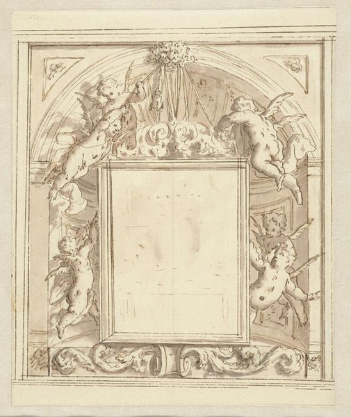
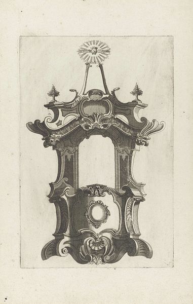
drawing, paper, ink
portrait
drawing
paper
form
ink
geometric
rococo
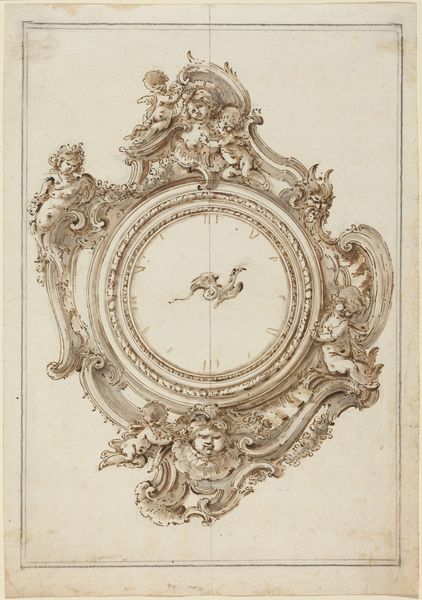
Dimensions: height 452 mm, width 336 mm
Copyright: Rijks Museum: Open Domain
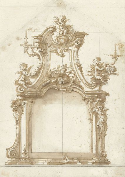
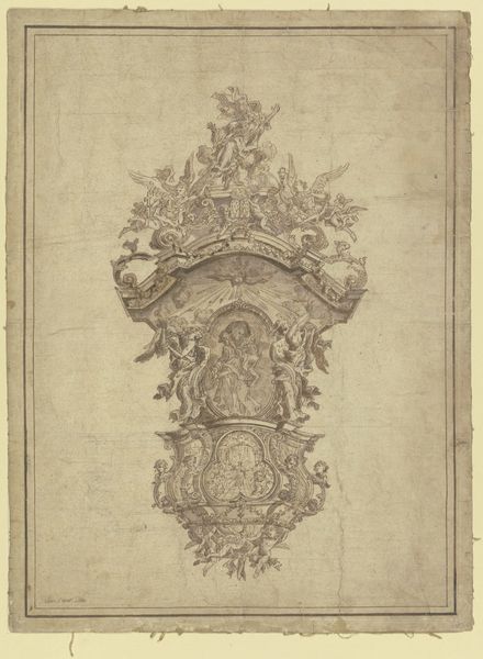
Editor: Here we have Giovanni Bettati's "Ontwerp voor een cartelklok," a design for a cartel clock made around 1760 to 1770. It’s ink on paper and gives the impression of an elaborate, almost baroque fantasy. It's visually very complex, but what can we really *see* in this piece beyond that initial impression? Curator: That "baroque fantasy," as you put it, speaks volumes! Think about the Rococo period, the context in which this was made. This design, with its emphasis on asymmetry and playful themes, was rebelling against the more rigid structures of the Baroque. It embraces the decorative arts as a form of high art, moving away from the historically male-dominated subjects, religious and historical, to explore what some would have considered lighter subjects, that are perhaps coded with notions of femininity. What might this say about the shifting roles of gender and class at that time? Editor: I hadn't thought of it that way, more of a playful reaction, not a coded argument. But the cherubs on top feel like the established order, gazing down...or is that my projection? Curator: Perhaps both? Even within the seemingly frivolous Rococo style, there’s a hierarchy being reinforced by their positioning. These details were consciously chosen. We must consider art as a participant, a form of rhetoric within its time. The clock isn't just telling time; it is also broadcasting the owner’s status, affiliations and perhaps also subtle socio-political allegiances. Editor: So, it's beautiful and subversive and...complicit? I’m seeing it from so many more angles now. Curator: Exactly. By viewing the piece from a social and historical point, not merely at the aesthetic, we can unveil more profound interpretations. It allows us to connect historical contexts with modern perspectives on class, gender, and power. Editor: That gives me so much to think about in terms of the stories these pieces are trying to tell about the people that commissioned them, too. Curator: And it urges us to reflect on our own biases as viewers, and challenge what seems 'natural' or 'expected'.
Comments
No comments
Be the first to comment and join the conversation on the ultimate creative platform.