Copyright: Sally Gabori,Fair Use
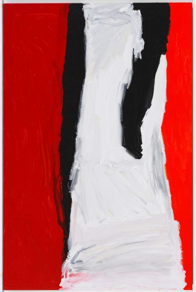
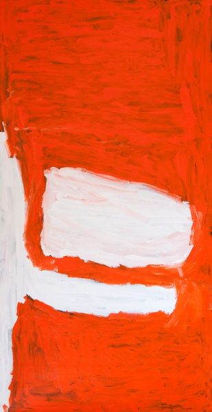
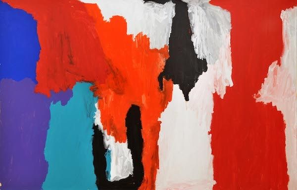
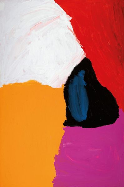
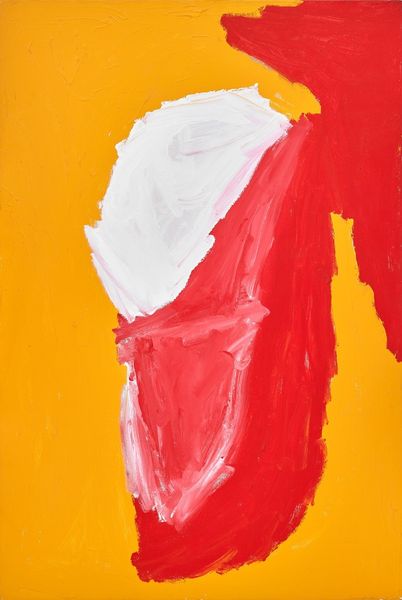
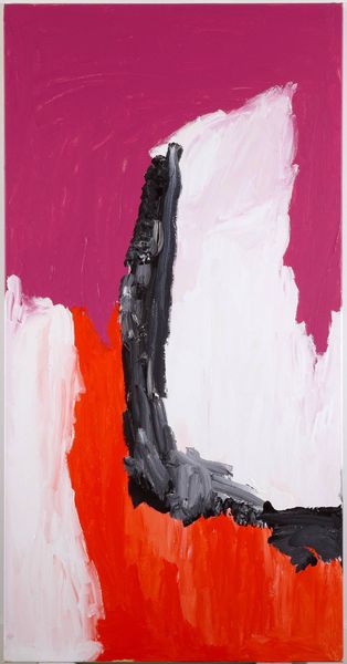
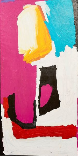
Editor: We're looking at "Makarrki" by Sally Gabori, created in 2008 using acrylic and oil paint. I’m struck by the boldness of the colors, particularly how the vibrant orange contrasts with the stark blacks and whites. What can you tell us about this piece? Curator: Notice how the composition eschews traditional perspective, favoring instead large blocks of color. Gabori manipulates the materiality of the paint itself. Thick impasto creates texture. Consider the lines themselves—their dynamism, their confident strokes. These elements supersede any mimetic representation. Editor: So, it’s less about depicting a specific thing and more about…the raw qualities of the paint and shapes? Curator: Precisely. One could argue the semiotics of colour comes into play here: the passionate 'heat' of the reds contrasting the stark austerity of black and white. But to reduce it solely to symbolism risks undermining the sheer visceral impact of the composition. Note that how the interaction of colors defines the structure. How does that make you feel? Editor: I see what you mean about the structure now! It really changes how I perceive the color interactions, and appreciate its aesthetic qualities. Curator: Consider how the materiality pushes us beyond simple interpretation. We are not asked "What does it MEAN?". The question is "What does it DO to us?". Editor: So, by focusing on the formal elements, we get a deeper sense of its emotional impact and constructional integrity? Curator: Precisely. Looking beyond immediate symbolic meaning brings us closer to understanding Gabori's innovative visual language and the work's pure artistic presence. Editor: Thanks! I learned how to focus on visual language rather than an immediate connection to historical context or specific stories to enrich my appreciation.
Comments
No comments
Be the first to comment and join the conversation on the ultimate creative platform.
More like this