Dimensions: height 258 mm, width 360 mm
Copyright: Rijks Museum: Open Domain
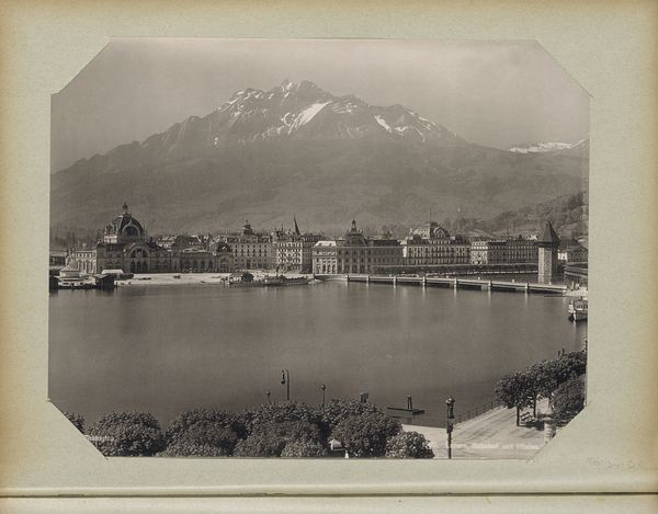
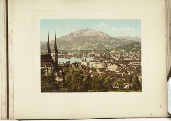
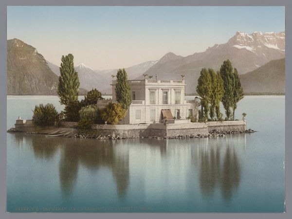
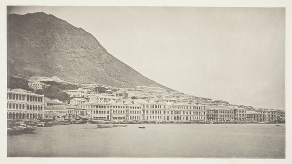
Curator: What a serene vista! The gentle reflections of the buildings shimmering on the lake create an almost dreamlike quality. Editor: Indeed. What we have here is "Gezicht op Luzern," or "View of Lucerne," dating from 1896-1897, a photochrom print created by Photochrom Zürich. This process essentially colorizes black-and-white photographs, a popular method in the late 19th century for creating postcards and souvenirs. It's currently held here at the Rijksmuseum. Curator: Photochrom, you say? It's funny, looking at it now, you get the same feeling as a really lovely watercolour. It almost tricks you, doesn't it? The calm water, the mountains... It’s peak picturesque! Did people even believe places were really *that* perfect back then, or were they in on the game, too? Editor: That’s an interesting question. The photochrom process, while seemingly straightforward, involved careful hand-coloring, allowing for a degree of idealization. The rise of tourism and the marketing of picturesque views went hand in hand. So, while reality surely inspired it, this print also fed into and shaped perceptions of Luzern as an idyllic destination. The visual vocabulary of impressionism was also deeply intertwined with late 19th-century ideas of the natural and picturesque. Curator: So it's like a visual remix, right? Part reality, part dream. It’s incredibly calming. It's almost too neat though, like someone arranged a stage set of architecture, landscape, light, everything. Which, I suppose, someone sort of did! Editor: Precisely! This photo speaks volumes about the commodification of beauty, capturing a yearning for idealized landscapes and architectural harmony. We can see it as a document reflecting societal aspirations and marketing strategies during the dawn of mass tourism. Curator: Fascinating! It’s hard to believe that something so… simple to look at holds so much complexity. Editor: I think it’s precisely that deceptive simplicity that makes it so compelling.
Comments
No comments
Be the first to comment and join the conversation on the ultimate creative platform.