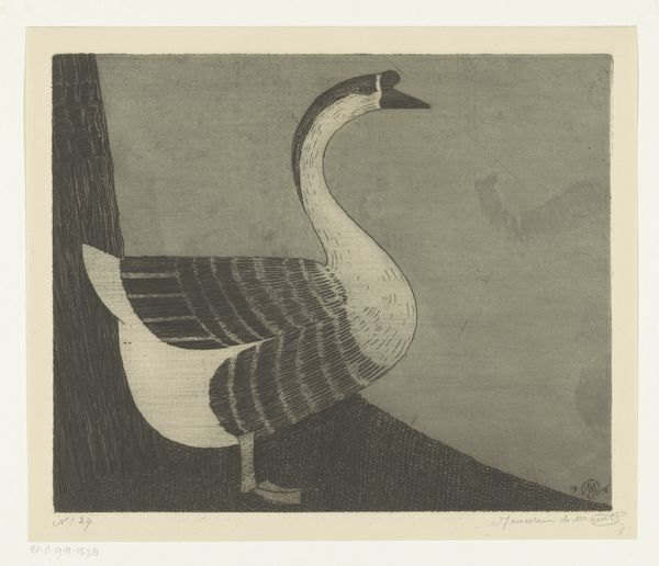
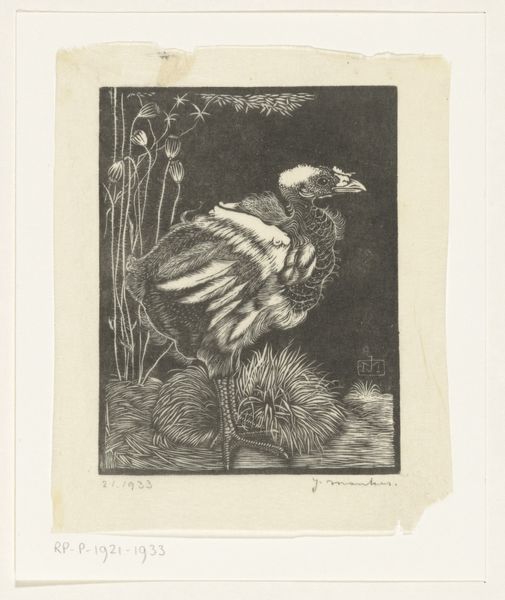
print, etching
#
light pencil work
# print
#
etching
#
landscape
#
figuration
#
symbolism
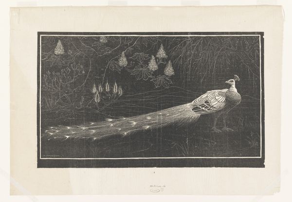
Dimensions: height 137 mm, width 208 mm
Copyright: Rijks Museum: Open Domain
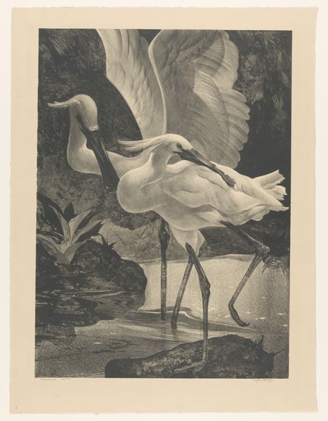
Curator: Here we have a striking print by Henri Verstijnen, titled "Pauw in een landschap," or "Peacock in a Landscape," dating sometime between 1892 and 1931. Editor: My initial impression is one of melancholy and subdued grandeur. The darkness is quite heavy, isn't it? The peacock looks almost ghostly. Curator: The work is an etching, which lends itself beautifully to capturing such tonal variations. Think about the labor involved, the careful application of acid to the plate to create those delicate lines, holding it to a very slow process. Editor: Absolutely, and I think the peacock, specifically, is such an interesting choice. For centuries, across cultures, it's symbolized vanity, pride, even immortality. But here, set against this almost oppressive dark, it feels… vulnerable. The flowers that seem to glow may also be the symbols that counterpoint this darkness? Curator: The tension between beauty and decay is certainly palpable. What kind of inks they might have used at the time, and the papers. Consider how different that would be today? Would modern methods and materials allow for the same texture and symbolism. Editor: Yes, texture. There's almost a ghostly quality to its presence. One could wonder if the landscape serves as a reflection of inner turmoil, a stage for psychological drama playing out within the artist himself? Curator: It pushes against that separation. How can you consider Verstijnen’s status and means, alongside his choices in producing this? Does it signal a particular commitment? Is this artwork, therefore, necessarily separate from other labor? Or is the material inherently related? Editor: Well, it makes one consider how the medium enhances or challenges our understanding of established motifs. A peacock, normally brilliant and vibrant, reduced to shades within this darkened setting is a paradox itself! It prompts reflection. Curator: I find it really speaks to how material choices deeply affect interpretation. Editor: I agree. Examining the artist’s chosen iconography coupled with that subdued color palette provides a rather unique glimpse into perhaps a soul seeking transcendence despite adversity, but by considering his methods too, we allow for a fuller image of Verstijnen as a person.
Comments
No comments
Be the first to comment and join the conversation on the ultimate creative platform.
More like this