graphic-art, print, photography, typography
#
portrait
#
graphic-art
#
aged paper
#
page thumbnail
#
newspaper
# print
#
photography
#
paragraph style
#
typography
#
spread layout sheet
#
journal
#
newspaper layout
#
handwritten font
#
page layout
#
word imagery
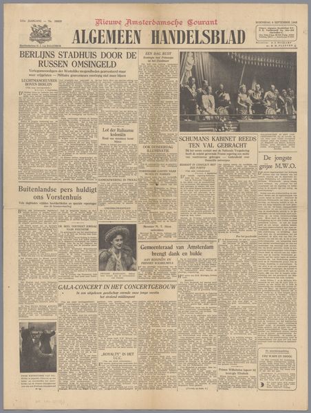
Dimensions: height 60 cm, width 45.5 cm
Copyright: Rijks Museum: Open Domain
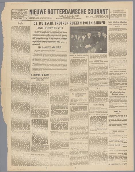
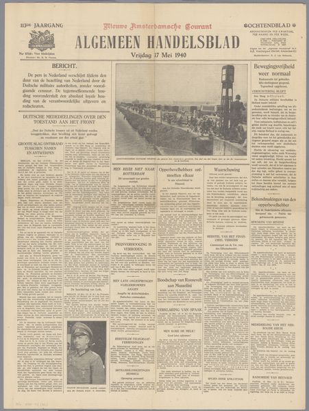
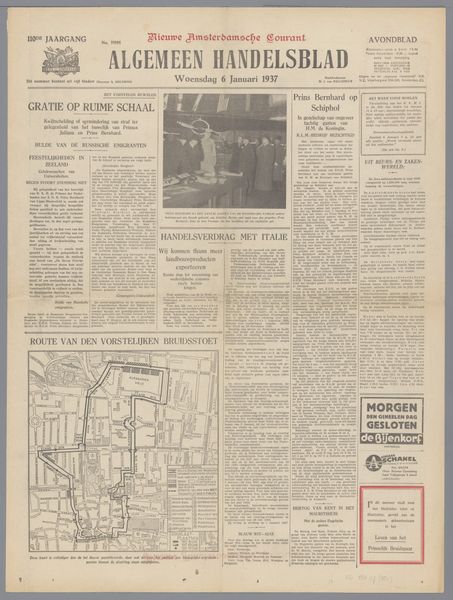
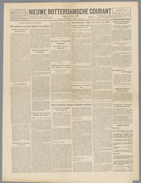
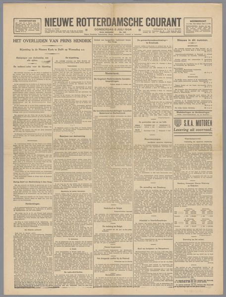
Curator: Here we have a striking piece of graphic art, an edition of the "Algemeen Handelsblad," a Dutch newspaper possibly from September 29, 1939. It’s primarily typography and photography combined in a startling page layout. Editor: My immediate reaction is a sense of stark historical gravity. The black and white photography and dense text create a claustrophobic feeling. It evokes a particular moment in time… perhaps a time of crisis? Curator: Indeed. The newspaper's layout reveals a rigid structure. Notice the columns and how each story is compartmentalized, creating a clear visual hierarchy. This design suggests a desire to present information with order and authority. We can analyse this using structuralist theory, noting the binary oppositions at play: order versus chaos, information versus noise. Editor: And that authority is key, I think, to understanding the impact of this historical artifact. Looking closer, we see headlines referring to Moscow and Berlin striving to end the “state of war”. The Molotov-Ribbentrop Pact was signed just weeks before this edition. This newspaper, while seemingly objective in its presentation, participated in the construction of that historical moment. The pact was a betrayal of leftist movements everywhere, presenting the Soviets and Stalin in a suspicious, and potentially dangerous, light. Curator: Precisely. Further emphasizing order is the careful selection of font types. The headline font communicates a sense of importance, while the body text is clear and functional, prioritizing readability. We must ask, what does each stylistic choice evoke and how does it reinforce the message of the page? Editor: I see it somewhat differently. The choice to display these announcements in such a way reinforces existing structures of power, serving specific state interests during this precarious geopolitical moment. The paper operates as an organ for distributing the accepted narratives of the period. The "page thumbnail," the layout – these elements should encourage the critical examination of its power dynamics, particularly concerning its historical role in shaping public perception of Stalinist Russia during the build up to WWII. Curator: These aesthetic decisions work together to project an aura of truth and reliability. Editor: It forces us to question its intentions. After all, whose truth is being represented? It presents us with a curated reality designed for mass consumption. Curator: Precisely the effect newspaper aims to make through calculated semiotic design. Editor: A stark and disquieting echo from the past. Curator: Indeed, a valuable lesson in critical seeing and understanding designed intent.
Comments
No comments
Be the first to comment and join the conversation on the ultimate creative platform.
More like this