print, paper, typography
#
aged paper
#
homemade paper
#
paper non-digital material
# print
#
hand drawn type
#
paper
#
personal sketchbook
#
typography
#
journal
#
fading type
#
storyboard and sketchbook work
#
historical font
#
columned text
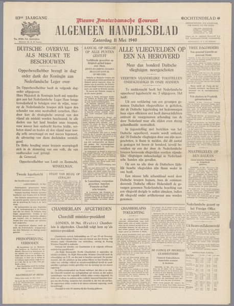
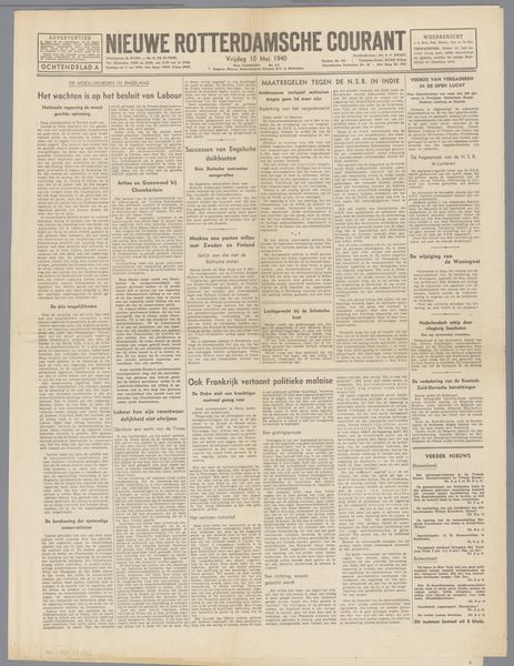
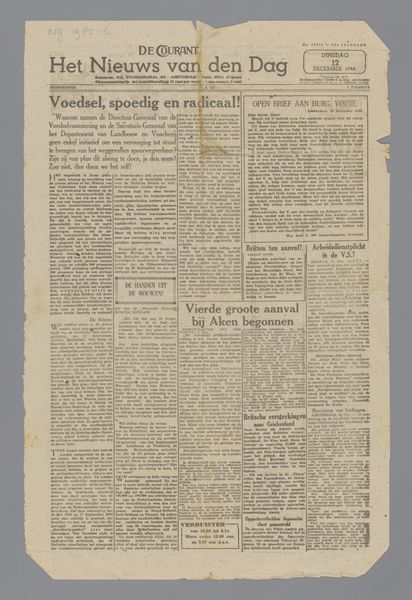
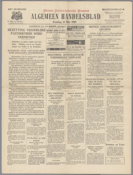
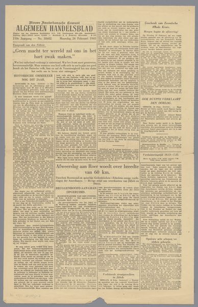
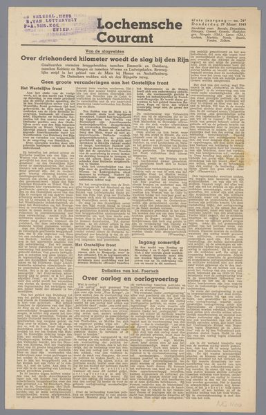
Dimensions: height 59 cm, width 45 cm
Copyright: Rijks Museum: Open Domain
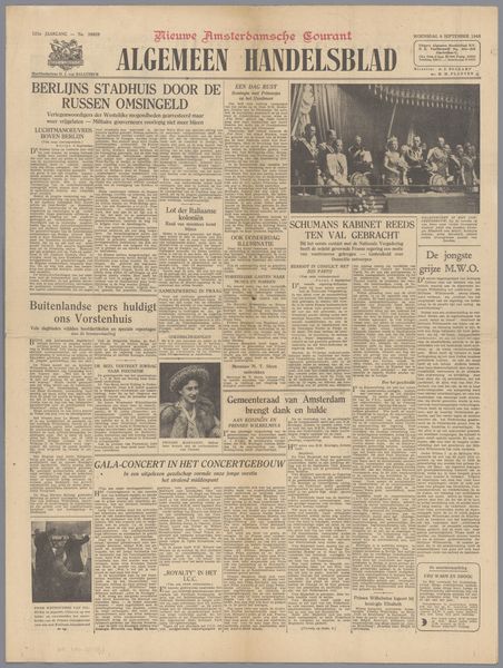
Editor: So, this is the "Algemeen Handelsblad," a print on paper, possibly from 1937. I’m immediately struck by the density of information—it feels so different from how we consume news today. What grabs your attention when you look at this? Curator: Ah, a fascinating artifact, isn't it? It’s like looking into a time capsule, isn’t it? I’m drawn to the interplay between the historical font and the columned text. Each choice reflects an urgency and a different sensibility about design; it feels hand-crafted almost. What does it tell you? Editor: It definitely feels more "human," for lack of a better word. More artisanal, maybe. Today’s news is so clean, so optimized... this feels like someone really *made* this. Curator: Exactly! Think of the hand drawn type; a person designed this to catch your eye. And then the homemade paper itself—slightly imperfect, aged—it hints at a whole production process so unlike today's digital newsprint. I wonder about the fading type, almost ghostlike… Did they choose ephemeral inks intentionally to signal a contrast from long lasting art? Do you get that feeling? Editor: It's true; I do! It makes me consider the lifespan of information back then, how disposable and precious it may have been at once. You know, quickly consumed and discarded. But still, here we are, looking at it almost 100 years later. Curator: Precisely! We are peering through time, considering context and material. Thank you for sharing your initial take, as I would never had focused my attention on the temporality implied. Editor: And thank you. I wouldn't have considered the choices around typefaces in their historical context without your perspective.
Comments
No comments
Be the first to comment and join the conversation on the ultimate creative platform.
More like this