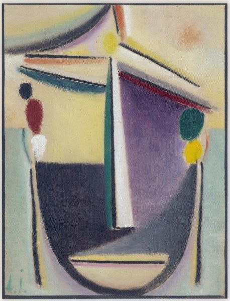
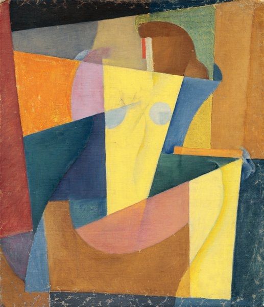
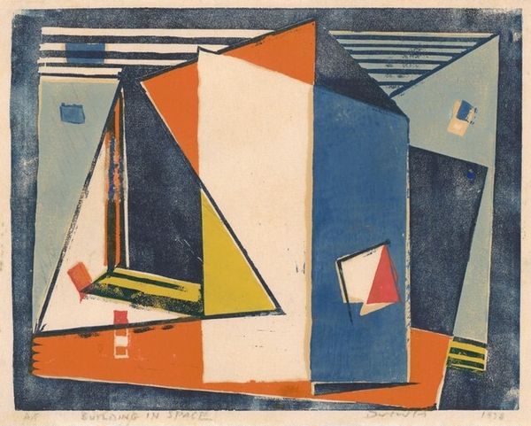
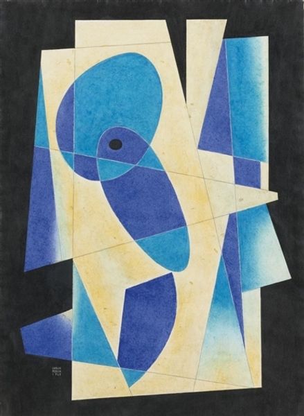
painting, watercolor
#
water colours
#
painting
#
abstract
#
watercolor
#
geometric
#
expressionism
#
abstraction
#
modernism
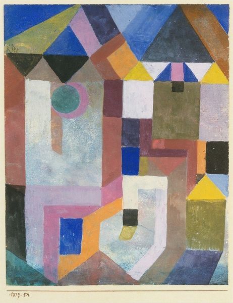
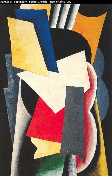
Copyright: Public Domain: Artvee
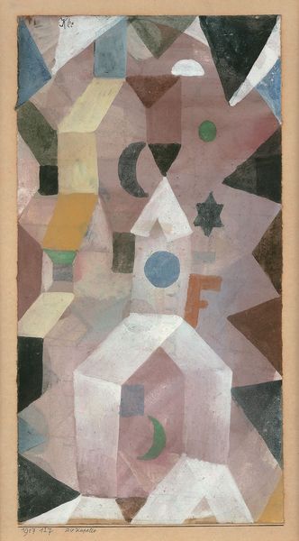
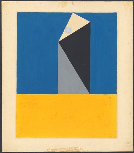
Editor: We are looking at Paul Klee’s watercolor, *The Idea of Firs*, from 1917. I am struck by the interplay of these cool and warm geometric shapes – triangles and rectangles creating an abstract forest. What do you see in this piece? Curator: I see a rigorous investigation of form and color relationships, independent of any representational imperative. Klee has constructed a pictorial space defined by the interactions of line, plane, and chromatic value. Note how the translucent washes of color overlay and intersect, generating new hues and spatial ambiguities. Consider the relationship between the perceived depth and the flat picture plane. Do you see how the overlapping creates a sense of space, yet simultaneously emphasizes the surface? Editor: I do! The overlapping shapes trick my eyes. So the point isn’t necessarily to *see* fir trees, but rather to understand how shapes and colors can create an illusion of them? Curator: Precisely. Klee’s deliberate arrangement prompts us to contemplate the formal devices that constitute an image, divorcing it from mere imitation. Look at the single square enclosing sharp shapes and lines. Its unique structure within the whole work generates visual interest. What effect does it create? Editor: It focuses the eye, almost as if the whole painting were a network leading to that one...focal point, maybe? This has really reshaped my understanding about abstraction, focusing less on *what* is depicted, and more on *how* it’s depicted. Curator: Indeed. Klee is revealing the architecture of perception itself. Hopefully you will carry it into future observations and analyses.
Comments
No comments
Be the first to comment and join the conversation on the ultimate creative platform.
More like this