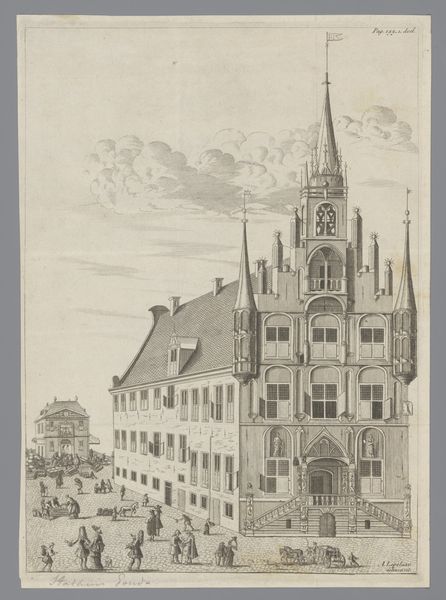
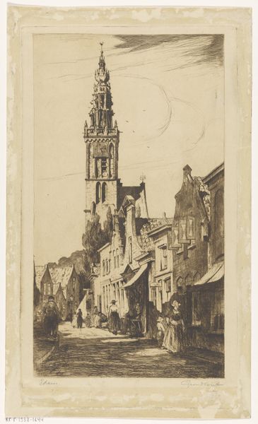
print, engraving, architecture
baroque
dutch-golden-age
landscape
perspective
cityscape
engraving
architecture
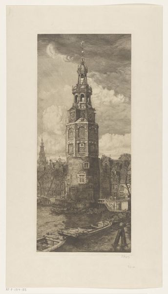
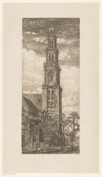
Dimensions: height 282 mm, width 162 mm
Copyright: Rijks Museum: Open Domain
Editor: So, this is a print called "View of the Munttoren in Amsterdam," dating back to 1726. It's currently housed at the Rijksmuseum. Looking at the rendering of the buildings against the cloudy sky, what is striking is the rendering of texture throughout. What can you tell us about it? Curator: The emphasis is undeniably on form and technique. Note the precision of the line work throughout the print. The composition draws our attention to the central tower through a careful use of perspective, achieved using various line weights in the detailed depiction of the architecture, sky and reflections in the water.. Consider the effect of light and shadow on the tower. Does it appear purely representational, or is something else at play? Editor: Representational, I guess. I'm just thinking, this feels very controlled and ordered. Not just in the lines, but the whole atmosphere feels staged and peaceful, right? Curator: Precisely. What structural elements support your perception of order? Note the calculated placement of figures and boats. They contribute to an overall balance that enhances the tower's imposing form. Does the print successfully portray space using tone, size, and contrast to establish depth? Editor: Yes, you can really feel the distance as things fade away in the background. It's clever how the engraver used that. But it also feels static, almost like a stage set with perfect order, rather than real life. Is that intentional? Curator: Observe the intricate pattern language achieved by rendering all things through line weights and patterns of hatching and cross-hatching. Every space in the visual field has equal amounts of rendering; as a result the surface and picture plane of the image comes to the forefront of the experience, despite our perception of representational 3D space. It almost ceases to represent reality, and stands apart as an autonomous arrangement of pure texture and shapes. What, therefore, becomes of our reading of this city? Editor: Wow, I didn’t think about that! Thinking of the arrangement of textures being more of the “subject” is very enlightening. Curator: Indeed. Attending to such internal structures often eclipses readings oriented towards historical interpretations.
Comments
No comments
Be the first to comment and join the conversation on the ultimate creative platform.