drawing, paper, ink
#
portrait
#
drawing
#
script typography
#
hand-lettering
#
playful lettering
#
hand drawn type
#
hand lettering
#
paper
#
personal sketchbook
#
ink
#
hand-drawn typeface
#
fading type
#
sketchbook drawing
#
small lettering
Copyright: Rijks Museum: Open Domain
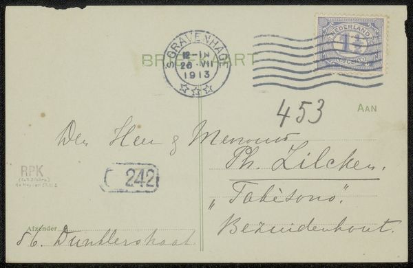
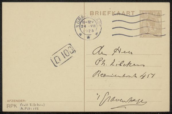
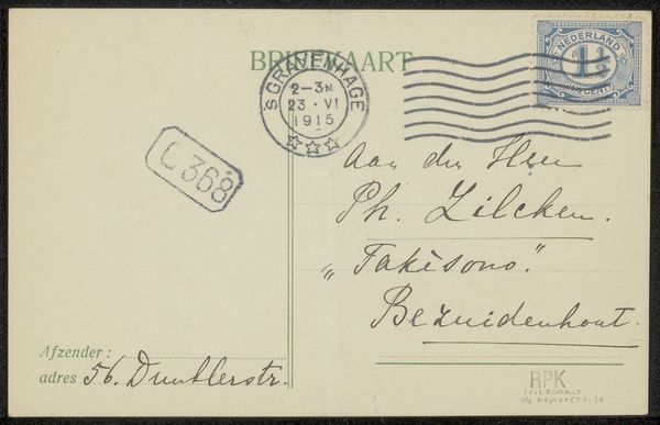
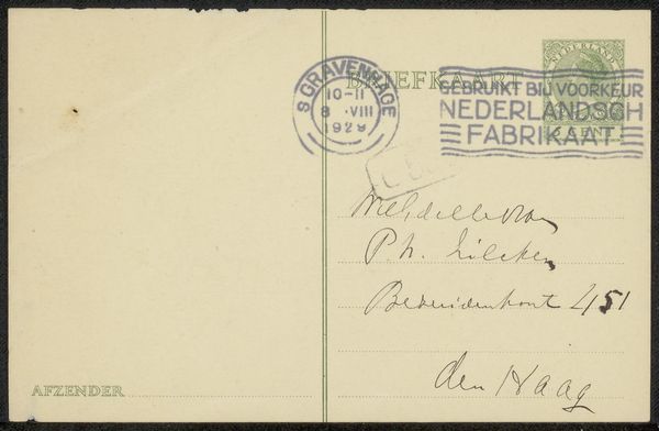
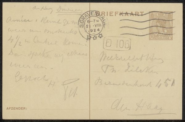
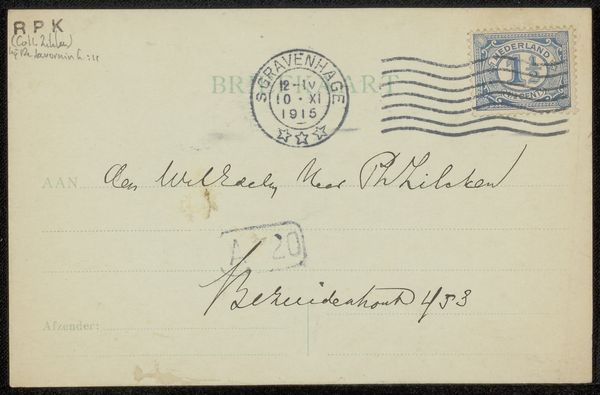
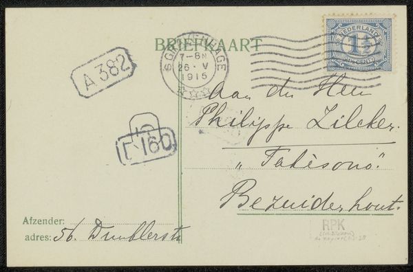
Curator: Ah, here we have "Briefkaart aan Philip Zilcken," a drawing on paper, likely from 1927-1928, by Edward B. Koster. Editor: It feels so immediate, almost ephemeral. Just a quick, utilitarian message rendered in ink. Curator: Precisely. Notice how Koster utilizes the pre-printed elements of the card. The careful, almost calligraphic hand-lettering of the address juxtaposes the bureaucratic stamps and pre-printed text. It is both intimate and commercial at once. Editor: The act of sending that material—cardstock, processed with a stamp of the postal system—seems almost mundane in comparison to Koster’s meticulous ink work. You can feel the history in the material of the card, in the way ink fades and bleeds slightly into the paper. The postal stamp partially obscures his hand. Curator: Consider the interplay between text as image and text as message. The address for Zilcken is rendered with a clear attention to the visual form of the letters, almost as if the practical function of directing mail takes second place to its graphic elegance. There is almost a playfulness in how the lettering dances above the guideline. Editor: Yes! I was struck by that. The deliberate choice to hand-letter suggests a rejection of industrial efficiency, a slower, more personalized approach. This was someone taking their time, leaving a material record of that intentionality, imbuing a simple postal message with artistic labor. The social implications are quite interesting: the gesture involved in slowing down this form of sending, pushing against the accelerating pace of mass-produced communication… Curator: Which makes the standardization of the pre-printed components of the postcard all the more striking. These are formal relationships, creating tension, between line and form, precision and freedom… Editor: It all points to the layers of material practices involved in creating and disseminating even the most humble artworks. What appears, at first, as something almost disposable becomes a study of both intentional craftsmanship and institutional process. Curator: Yes, reflecting on its simple yet profound composition gives a view to understanding the relationship between artist, audience, and artwork within specific socio-cultural circumstances. Editor: An everyday interaction given depth through the hand.
Comments
No comments
Be the first to comment and join the conversation on the ultimate creative platform.
More like this