script typography
hand-lettering
hand drawn type
hand lettering
personal sketchbook
hand-drawn typeface
fading type
sketchbook drawing
sketchbook art
small lettering
Copyright: Rijks Museum: Open Domain
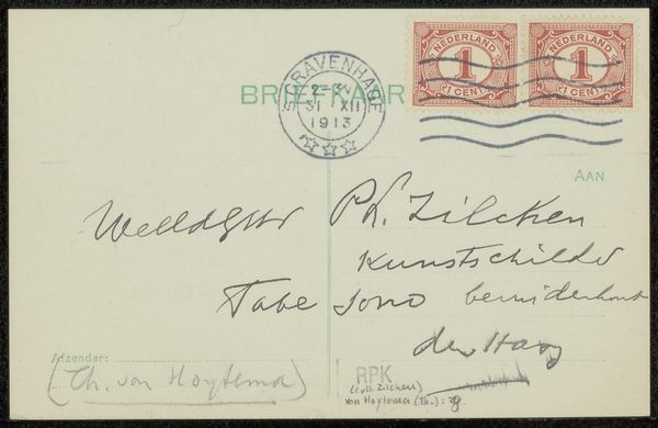
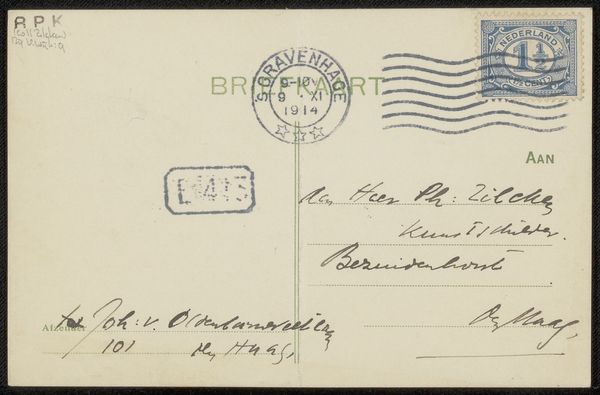
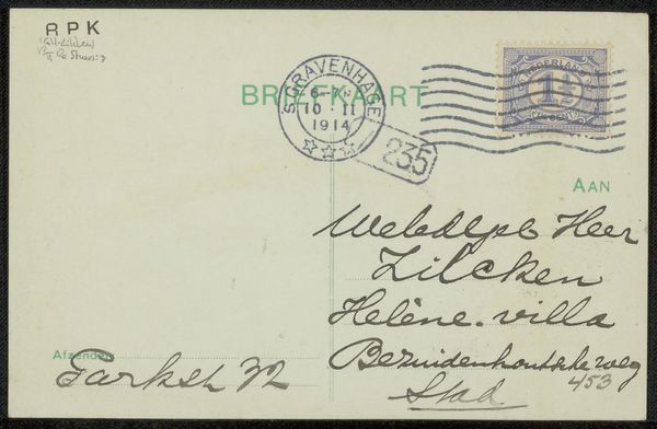
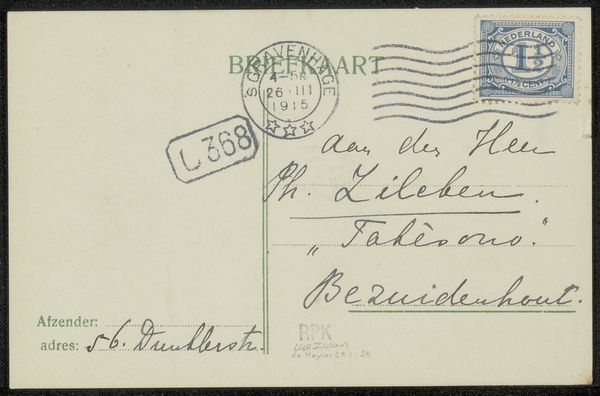
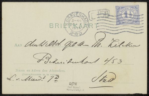
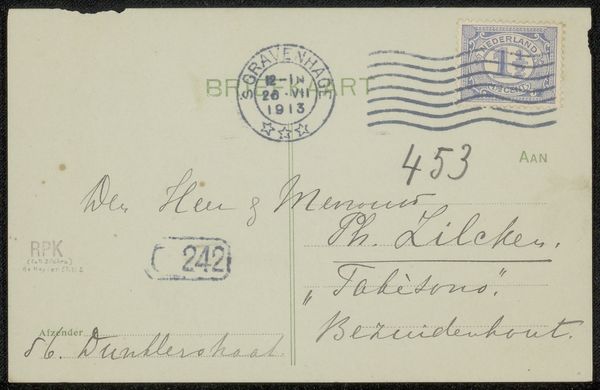
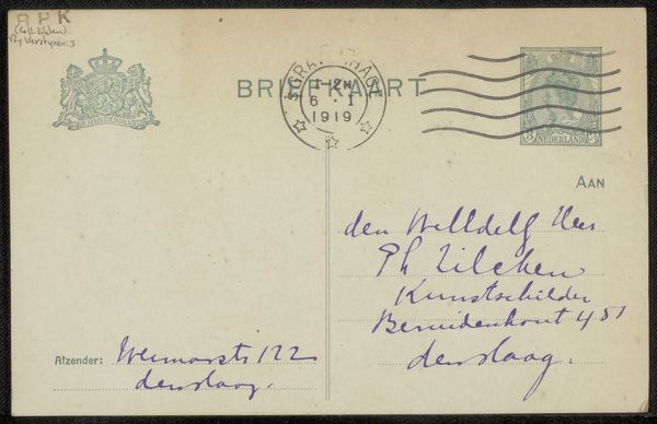
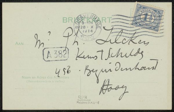
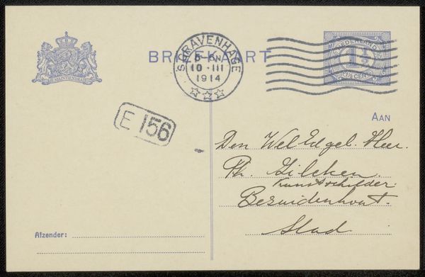
This 'Briefkaart aan Philip Zilcken', or postcard, was made at some point by Barbara Elisabeth van Houten. It's interesting to consider a postcard as a work of art, especially as a painter myself. Look at the way the ink sits on the card, soaked in and spread out in places and thin and precise in others. The contrast between the handwriting and the stamp and the way these were clearly applied at different times, by different people, with different intentions, makes the piece feel very much alive. There's something intimate about handwriting that printing obscures. The pressure applied to the pen, the pauses between words, the little quirks of each letter – these all speak to the person who wrote it. You can see that the card was stamped in 1914, so this little note was making its way through the world amidst the chaos of war. It reminds me of some of the more personal works of Cy Twombly – so filled with gestures that point to intimacy. Art is fundamentally a conversation, across time and space, embracing ambiguity.
Comments
No comments
Be the first to comment and join the conversation on the ultimate creative platform.