Het boek in onze dagen / beschreven en afgebeeld door R. van der Meulen 1892
0:00
0:00
graphic-art, print, typography
#
script typeface
#
graphic-art
#
aged paper
#
art-nouveau
# print
#
typography
#
hand-drawn typeface
#
fading type
#
thick font
#
handwritten font
#
classical type
#
decorative-art
#
thin font
#
historical font
#
small font
Dimensions: height 228 mm, width 158 mm, thickness 24 mm
Copyright: Rijks Museum: Open Domain
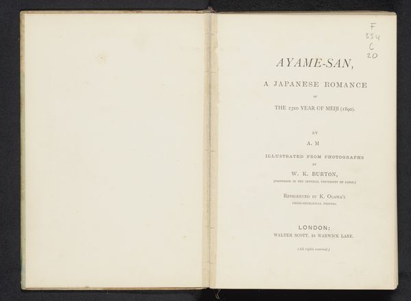
This is the title page of ‘Het boek in onze dagen’, a book by Rimmer van der Meulen, printed in 1902. The visual structure here is clean and deliberately balanced. The layout employs a minimalist aesthetic, focusing on the interplay between text and space. The typography, executed in a straightforward serif font, speaks to the functional aspects of the book. It is designed more for utility than for decoration. This pared-down approach mirrors late 19th-century functionalism. The structuralist approach to book design emphasizes the book’s role as a medium. Note how the emptiness of the page draws attention to the act of reading itself. By stripping away ornamentation, the designer invites us to consider the very essence of what a book is for, its purpose as a vehicle for communication and knowledge. The design embodies a shift in thinking, valuing clarity and function over elaborate displays. This resonates with broader intellectual movements questioning traditional values and exploring new modes of expression.
Comments
No comments
Be the first to comment and join the conversation on the ultimate creative platform.
More like this