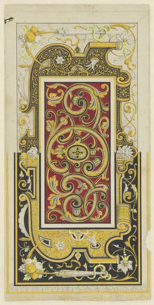
graphic-art, print
#
pattern-and-decoration
#
graphic-art
#
decorative element
# print
#
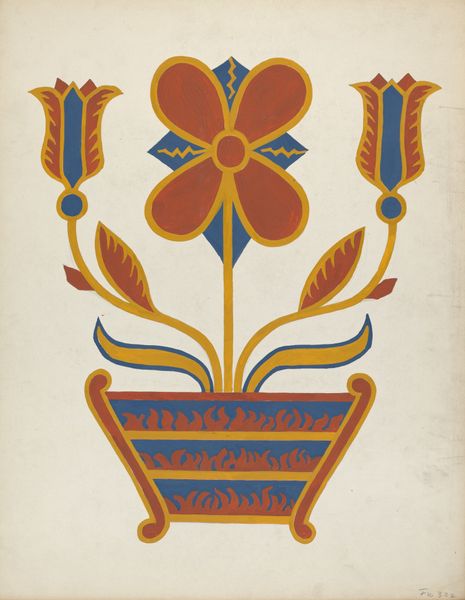
flower pattern
#
decorative-art
#
decorative art
Copyright: Public Domain: Artvee
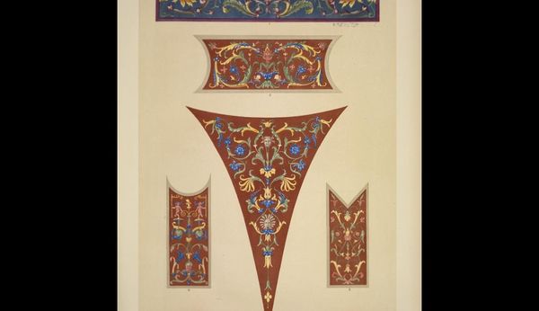
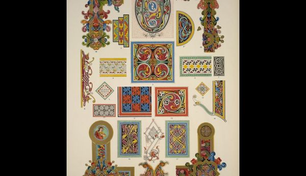
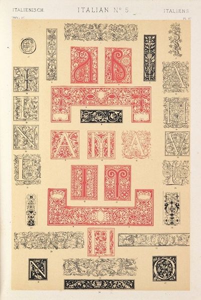
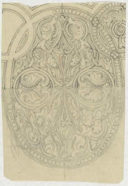
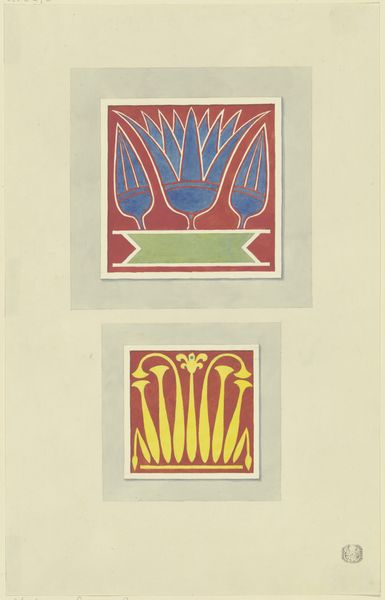
Editor: Here we have Owen Jones’ “Italian No. 4”, a drawing created in 1856. It's a series of ornate, colorful, and patterned shapes that feels very intentionally designed. What visual elements stand out to you? Curator: The defining characteristic is clearly the dense ornamentation across these diverse shapes. Observe the calculated interplay between the grounds—crimson, cerulean—and the botanical motifs. How would you describe the linear structure? Editor: It looks like there's a strong emphasis on symmetry and repetition, with organic forms arranged within geometric constraints. Does that linearity impact its impact? Curator: Precisely. Consider how the balanced symmetry contributes to a sense of order, perhaps even suggesting an architectural application. These shapes feel like potential templates. Are the various grounds successful at framing the intricate organic and curvilinear embellishments that occupy those spaces? Editor: Absolutely! The contrasting backgrounds make the gold, greens, and blues really pop, but some sections, like the bottom-most horizontal band, feel crowded and overwhelming. Curator: Indeed. And have you considered the symbolic resonance of these vegetal patterns? Notice how leaves and blossoms repeat with subtle variations that play against our sense of rhythm and structure. Is there any section of particular aesthetic interest for you? Editor: The elongated triangular form – design number three – seems the most resolved. The floral patterns feel grounded within the larger shape, achieving an elegant harmony. Curator: I concur. Owen Jones, through calculated orchestration of form and colour, transforms basic geometric planes into aesthetic patterns. Reflecting on our conversation, what insights did you glean concerning this piece? Editor: Thinking about it in terms of shapes, colors, and structure, helps to put aside historical context to understand what stands out, or even clashes. Curator: I quite agree. Sometimes simplifying our interpretation helps one better appreciate the building blocks that compose a work.
Comments
No comments
Be the first to comment and join the conversation on the ultimate creative platform.
More like this