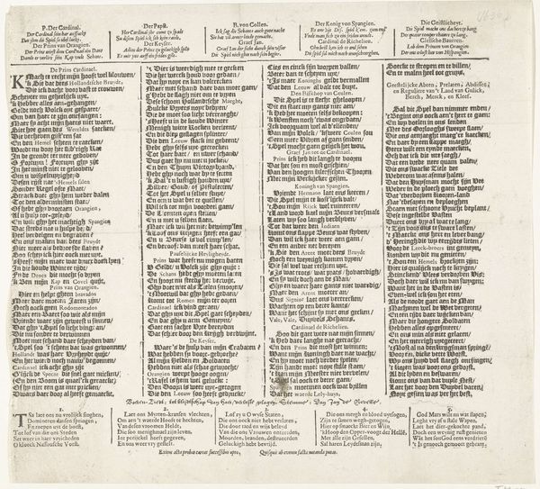
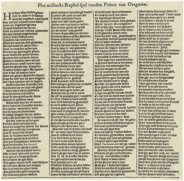
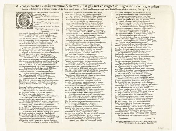
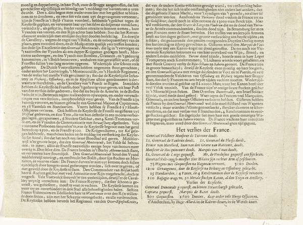
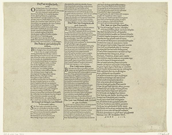
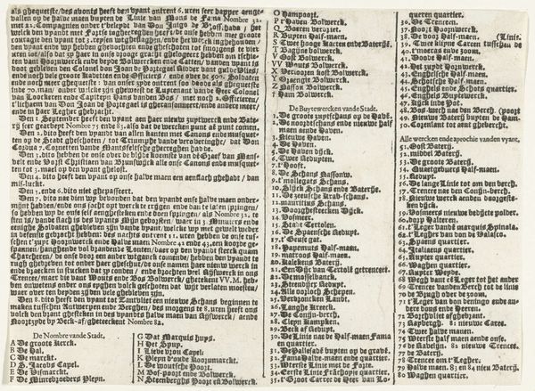
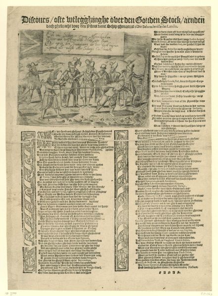
Samenspraak behorend bij een spotprent op het mislukte beleg van Schenckenschans, 1599 1599 - 1601
0:00
0:00
graphic-art, print, paper, engraving
#
graphic-art
# print
#
paper
#
text
#
history-painting
#
engraving
Dimensions: height 278 mm, width 307 mm
Copyright: Rijks Museum: Open Domain
Curator: Here we have "Samenspraak behorend bij een spotprent op het mislukte beleg van Schenckenschans, 1599", a print dating from around 1599 to 1601 by an anonymous artist. It's a complex image, entirely filled with text and a few symbolic figures. Editor: Yes, it definitely strikes me as a piece of propaganda, very dense and hard to decipher at first glance. It feels like a visual and textual overload. What visual elements are most significant to you in understanding it? Curator: Well, focusing on the formal elements, consider the sheer density of the text. The engraving technique allows for minute detail, filling every available space. The artist creates visual tension, doesn't it? There’s no restful space for the eye, mirroring perhaps, the tension of the siege itself. Observe how the text is divided into distinct blocks; notice how their arrangement contributes to the overall impact. What feeling does the distribution of text evoke for you? Editor: I suppose it emphasizes the feeling of being bombarded, overwhelmed by information... or perhaps misinformation in this case. The use of blocks and division reminds me of an organized attack or perhaps a very complex legal document, as in difficult to navigate and designed to trap you. Curator: Precisely. And what about the font? Editor: The typeface appears dense and angular, evoking the starkness of metal type—all sharp angles and high contrast. Its design certainly amplifies the visual assault, reflecting an intention beyond simple conveyance of text. Curator: Indeed, and what about the few figurative components visible at the bottom right? Editor: Those illustrations introduce another layer; it breaks the visual rhythm and acts as a synthesis, revealing the truth. Overall it appears busy and chaotic. Curator: The composition and materials are completely in sync to deliver the message in this polemical piece of graphic art. Editor: I can definitely see that, after our discussion, my initial reaction, has given way to more informed analysis!
Comments
No comments
Be the first to comment and join the conversation on the ultimate creative platform.
More like this