Dimensions: height 157 mm, width 93 mm
Copyright: Rijks Museum: Open Domain
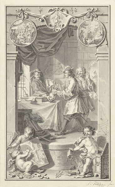
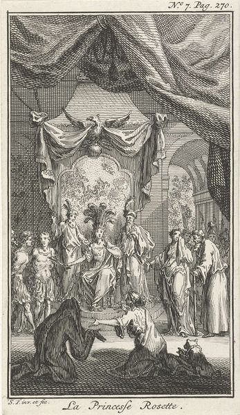
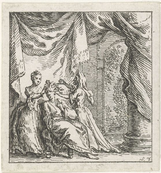
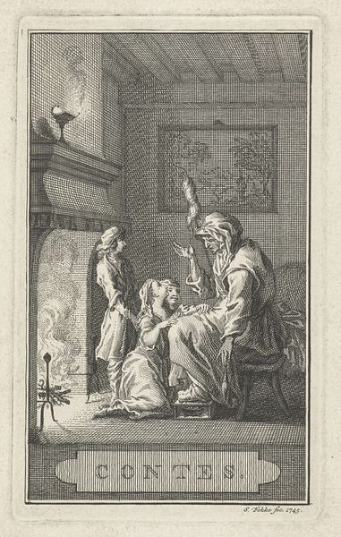
Editor: So, here we have "Doornroosje," or Sleeping Beauty, an engraving by Simon Fokke, created sometime between 1754 and 1784. The composition feels so formal and staged, unlike the fairytales I’m used to. What catches your eye about this piece? Curator: What interests me is how Fokke translates this fantastical narrative into a very particular social and political framework. Consider the setting: it's clearly an aristocratic interior. How does that shape the meaning of the fairy tale itself? Editor: Well, it certainly emphasizes the class aspect of the story, doesn’t it? The curse affecting royalty and all that. Does that mean Fokke is making some sort of commentary? Curator: Precisely! Think about the rise of the bourgeoisie in the 18th century. Fairy tales, often circulated orally amongst commoners, were being adapted and repackaged for wealthier audiences. What happens when you take a story about magic and put it in a very defined, almost theatrical aristocratic setting? Editor: It almost feels like the magic is… less magical? Like it’s a performance for an elite audience. Curator: Indeed. And notice the way the characters are posed, almost like actors on a stage. Fokke isn’t just illustrating a story, he’s presenting a vision of social hierarchy and the *performance* of power. Do you see a tension between the inherent 'folk' aspect and the presentation? Editor: I do now! I hadn’t considered the tension between the fairytale and the setting before. Curator: The way stories are adapted and consumed often reflects the values of the society doing the adapting. Consider how later interpretations of Sleeping Beauty also evolved… Editor: That’s fascinating. I’ll definitely look at other fairytale illustrations through this lens from now on. Thank you!
Comments
No comments
Be the first to comment and join the conversation on the ultimate creative platform.
More like this