Copyright: Public Domain: Artvee
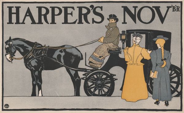
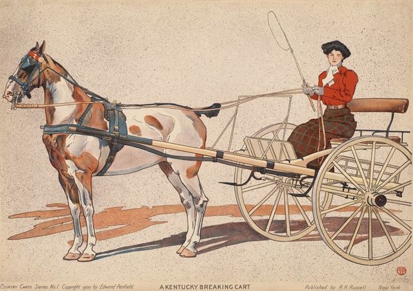
Editor: Here we have Edward Penfield's "Harper's November," from 1893, apparently a poster. The muted colors give it such a calm feeling, even though it depicts a busy city scene. I’m really struck by the poster’s graphic style. How do you interpret this work from a formalist perspective? Curator: Note the clever use of implied lines guiding our gaze. Consider, first, the sharp diagonal formed by the horse's reins, drawing us from the driver down to the waiting boy. The limited color palette, primarily earth tones and shades of gray, functions not to depict reality, but to unify the composition, further focusing attention on form and balance. Editor: The composition really directs where you look; you're right. What about the relation between figure and ground here? Curator: Indeed. The figures are not embedded in a deeply rendered space. Instead, they seem almost pasted onto a flat plane, highlighting the work's nature as a constructed image. The simplification of forms--the horse reduced to essential shapes, the figures lacking in fine detail--also forces us to confront the image as a deliberate artistic creation rather than a mere reflection of reality. This highlights its artifice, disrupting the idea of a straightforward representation. Editor: That makes me consider how stylized everything is! Thanks. It gives a new understanding of the intention and construction of this piece. Curator: My pleasure. Understanding how the formal elements interact really shapes our experience.
Comments
No comments
Be the first to comment and join the conversation on the ultimate creative platform.
More like this