Ghirlanda: Di sei vaghi fiori scielti da piu famosi Giardini d'Italia, page 6 (verso) 1604
0:00
0:00
drawing, print, paper, typography
#
drawing
# print
#
paper
#
typography
#
italian-renaissance
Dimensions: Overall: 5 7/8 x 7 7/8 in. (15 x 20 cm)
Copyright: Public Domain
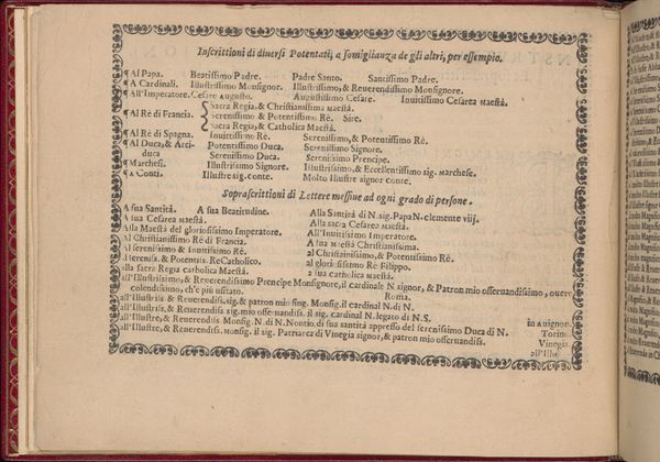
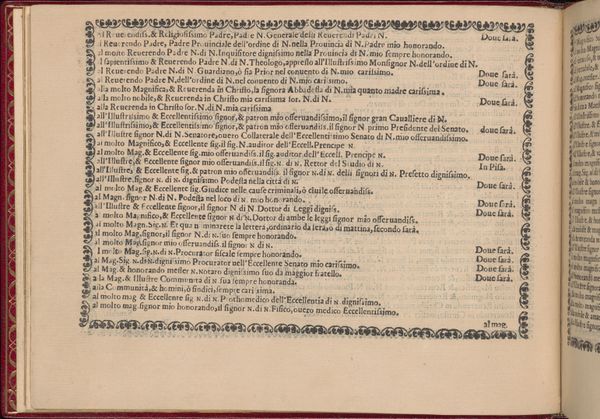
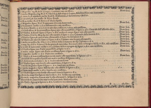
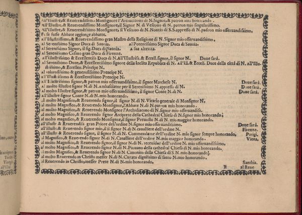
Curator: This striking image is from a page of “Ghirlanda: Di sei vaghi fiori scielti da piu famosi Giardini d'Italia,” dating back to 1604. Pietro Paulo Tozzi is credited with its creation. The work, housed at the Metropolitan Museum of Art, is a beautiful example of drawing and typography printed on paper. Editor: Immediately, I'm struck by the sheer density of the text and the way it's visually framed, almost like a garden itself, contained and cultivated. But what on earth does it all mean? Curator: It's a compilation of flowery dedications and compliments, a common practice in Italian Renaissance printmaking. Tozzi elegantly combined the graphic and the poetic on these pages, crafting personalized missives ready to be sent out. Editor: Personalized yet printed. The contrast amuses me! So, these weren’t unique to a specific recipient. Was this like Renaissance social media or pre-printed thank-you cards? Curator: Think of it as a sophisticated form of networking. Patrons would likely select the page that resonated most and then potentially add their personal touch. The phrases are carefully constructed—note the repetitions of "Illustre signor" and various terms of endearment like "carissimo," indicating a culture deeply rooted in social graces. Editor: So the flourishes act almost like symbolic motifs, embellishing each page in a unique manner. Did the intended readers see through the somewhat prefabricated intimacy? Curator: Doubtless, the artfulness resided in how skillfully one chose and deployed these pre-written compliments, tailoring them to suit each unique occasion or receiver. It became less about complete originality and more about finesse within established frameworks. It offered accessibility, as well, in a growing print-culture environment. Editor: Well, when seen as both written language and graphic presentation, I think it functions much like tapestry or other decorative art—demanding a closer look at the finer textures of language as ornamentation. The dots scattered across the design serve a purpose too, a little like asterisks directing the reader's attention through the web of compliments. I admire the skill on display. Curator: Agreed. It speaks to the nuanced interaction of text and image and even prefigures how we now blend templated structures with personalization in our contemporary communications. This is social networking centuries before the Internet. Editor: Well said. Now when you see it like that it definitely gains another dimension! A rather delightful, historical deep-dive into carefully structured flattery.
Comments
No comments
Be the first to comment and join the conversation on the ultimate creative platform.
More like this