graphic-art, print, typography
graphic-art
neoclacissism
typography
Dimensions: height 425 mm, width 310 mm
Copyright: Rijks Museum: Open Domain
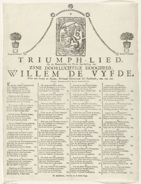
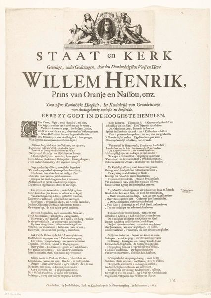
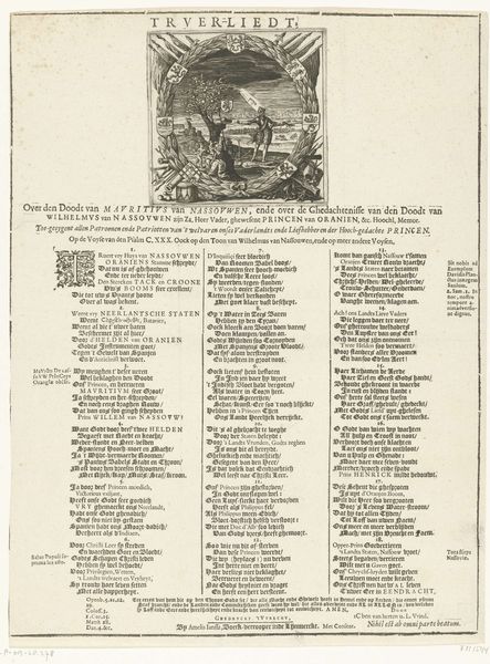
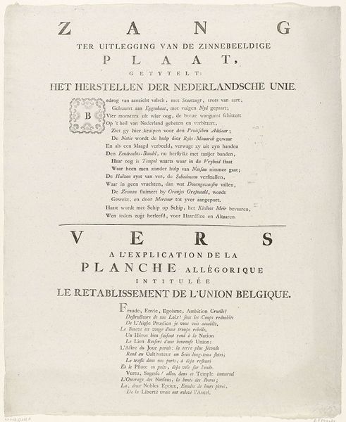
Curator: I'd like to focus on a broadside from 1788, titled "Lied op de veertigste verjaardag van prins Willem V," celebrating Prince William V's fortieth birthday. Editor: My initial impression is that this is less an artwork and more a public document—a pronouncement, if you will. All the dense text crammed onto the page gives it a very declamatory mood, doesn't it? Curator: Precisely! Though primarily typography, its aesthetic owes much to Neoclassicism. We see this especially in the ornate cartouche at the top, framing the princely coat of arms. The very symmetrical layout mirrors the era's emphasis on order and reason. Editor: The cartouche does indeed add a touch of visual sophistication. It's quite striking, though I find the font choices less refined. The tight leading diminishes readability for contemporary eyes. Do you notice how that typographical density affects the symbolic impact of the text as a whole? Curator: Well, that density mirrors the political climate of the time. The song's lyrics and imagery act as cultural symbols intended to inspire allegiance in the Dutch population to Prince William. Its creation reveals his family was working hard to preserve its heritage. It is using symbolic association to amplify patriotism during turbulent times. Editor: That's interesting. I hadn’t considered that a chaotic typography might also be an allusion to troubled times, a visual echo, perhaps, of socio-political disarray? That approach allows us to see disorder being captured by these lines on order. Curator: Yes, because we should keep in mind that at the time the print was published the Patriot movement challenged his rule; the Dutch Republic was riddled with turmoil! Such publications played a significant role in shaping public opinion, ensuring loyalty. The typography almost acts like a wall, safeguarding established power structures. Editor: It's remarkable how such simple elements—a cartouche, some dense lettering—can tell such a complex story. It serves as a great reminder of how form and content dance together to reflect culture. Curator: Indeed. Considering this particular print's historical weight alongside its simple, yet artful composition allows one to appreciate both its political impact and aesthetic significance.
Comments
No comments
Be the first to comment and join the conversation on the ultimate creative platform.
More like this