1830 - 1900
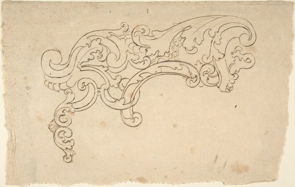
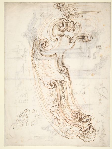
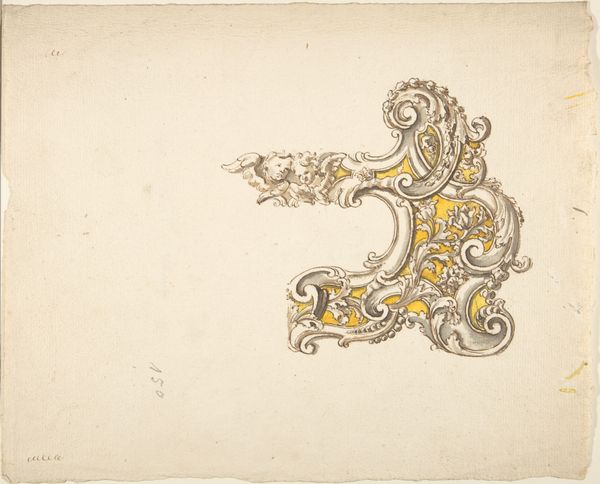
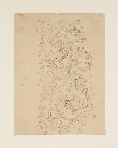
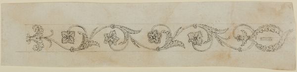
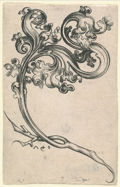
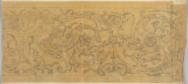
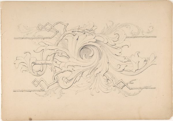
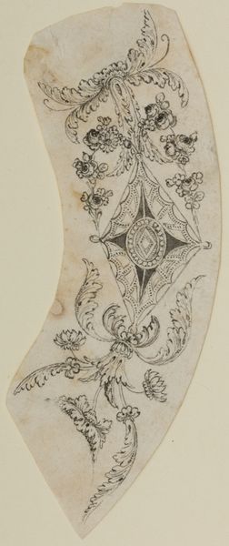
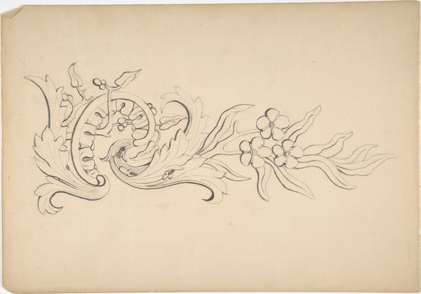
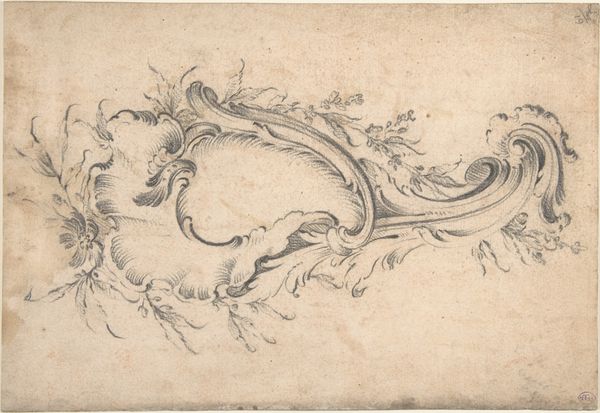
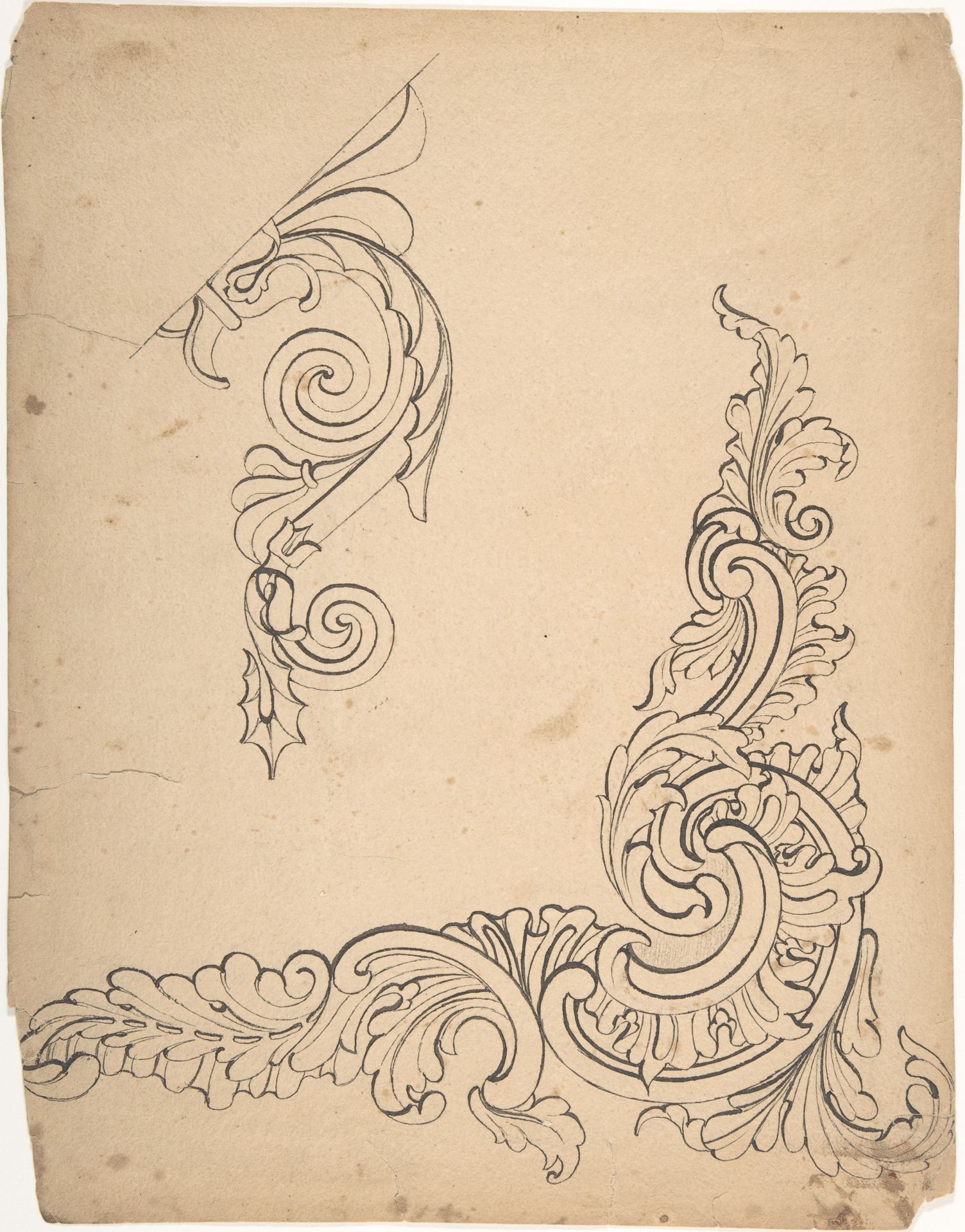
Designs for borders and corners, acanthus
Robert William Hume
1816 - 1904The Metropolitan Museum of Art
Metropolitan Museum of Art, New York, NYListen to curator's interpretation
Curatorial notes
Curator: I'm immediately struck by how alive these pen and ink drawings are, so delicate and considered. Robert William Hume’s "Designs for Borders and Corners, Acanthus," probably done between 1830 and 1900, invites us into a world of ornamental elegance. It’s housed at the Met, and, wow, is it evocative of a time when every detail mattered. Editor: Evocative, certainly! They whisper of old libraries, don't they? That deep, comfortable scent of aged paper and polished wood. The acanthus leaves curling so precisely—it’s all contained energy. A bit rigid, but also hinting at endless possibility, I would suggest! Curator: Possibility indeed! These designs, after all, are blueprints for future embellishments. The acanthus leaf, that ancient motif…it pops up everywhere from Greek capitals to…well, to wallpaper borders, I guess! What resonates with you about this emblem, Iconographer? Editor: The acanthus leaf…it's persistence as a symbol intrigues me. Its thorny beauty, suggesting resilience, luxury and rebirth—the way it keeps spiraling, echoing growth itself! Here it represents both classical aspiration and the craftsman's individual flair. Hume seems to both embrace the traditional form and experiment with it. It's an attempt to find fresh expression with old language. Curator: Absolutely. And you almost forget, staring at the finished product—say, on a grand building—the intense deliberation and sheer skill that go into its creation. This piece of paper is direct evidence! The artist is solving visual problems, and maybe enjoying the process as they are problem solving! Editor: Problem-solving with beauty in mind! Hume's linework feels incredibly confident. The composition, though a study piece, still has that spark, a reminder that the 'decorative' can possess surprising depth. A study piece such as this serves as a potent demonstration of an attempt to refine ideas and explore a potential theme. Curator: Looking closely at the larger corner piece I begin to notice the slight, yet distinct, variations. Some segments appear to have more deliberate, reinforced lines compared to other areas of that same section, adding nuance to an overall presentation of harmony! These design intentions come into view as one ponders more thoroughly, causing one to almost 'grow into the art,' if I may say so myself! Editor: What I appreciate most is its humble intent. It invites you closer to something otherwise easy to overlook. We move so fast past these gorgeous flourishes and, it is helpful for people such as myself, who adore details to become one with such expressions. Curator: Absolutely. It allows us to appreciate both what they symbolize but even more, why one is drawn to them so readily!