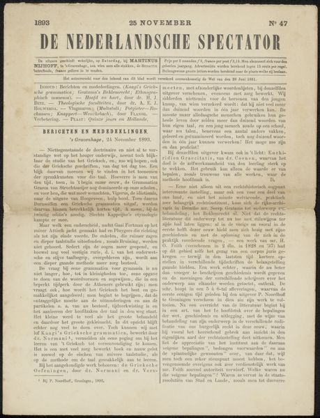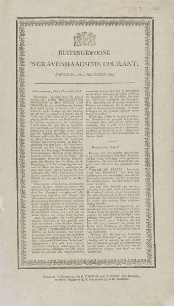
Nederlandsche Staats-Courant. Donderdag 29 Maart. No. 75. 1849 Possibly 1849
0:00
0:00
algemeenelandsdrukkerij
Rijksmuseum
print, paper, typography, engraving
#
old-fashioned
#
dutch-golden-age
# print
#
paper
#
archive photography
#
paragraph style
#
historical photography
#
typography
#
journal
#
old-timey
#
newspaper layout
#
history-painting
#
handwritten font
#
word imagery
#
engraving
#
social event documentation
Dimensions: height 450 mm, width 282 mm
Copyright: Rijks Museum: Open Domain
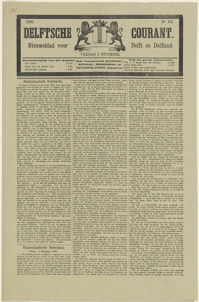
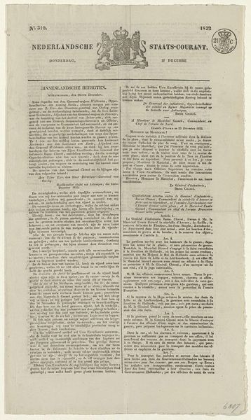
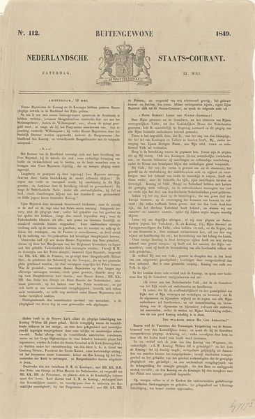
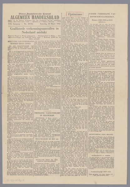
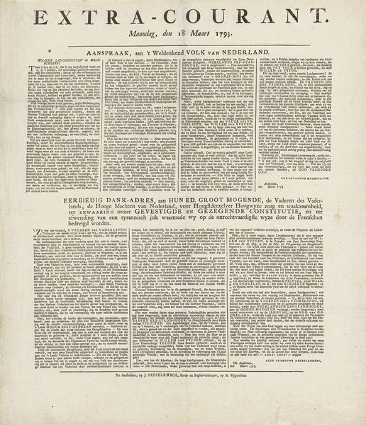
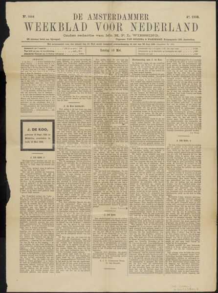
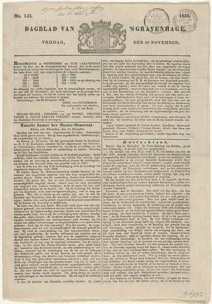
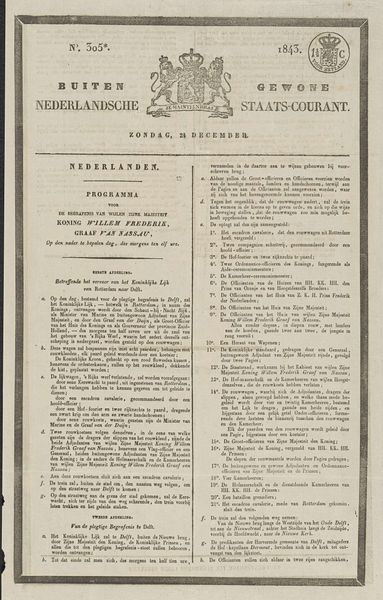
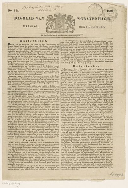
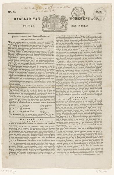
Curator: This print, dating possibly from 1849, is titled "Nederlandsche Staats-Courant." It appears to be a page from a Dutch newspaper. The dense typography strikes me immediately, as does the detailed coat of arms at the top. How do you interpret the composition of this historical artifact? Editor: The sheer amount of text is definitely overwhelming. It almost seems like the words themselves are the art, like a textured surface rather than something to be read. Can you tell me more about the visual strategies that might be at play here? Curator: Consider how the formal arrangement dictates the reading experience. The rigid columns and justified text create a sense of order and control. Note how the artist or printer, in this case Algemeene Landsdrukkerij, balances the textual density with the relatively open space at the top featuring the masthead and coat of arms. The coat of arms acts as a focal point, does it not? A symbol drawing the eye. Editor: Absolutely, the coat of arms breaks up the monotony of the text blocks, and the date clearly marks this as a product of its time. So, in this formal analysis, do we consider the typeface a conscious artistic choice? Curator: Undoubtedly. Typography functions as a visual element shaping perception. The typeface used here is characteristic of the period and carries its own connotations. Do you observe the deliberate hierarchy of font sizes? Editor: Yes, now that you point it out. Larger fonts denote headings, guiding the eye through the dense information. I never thought I would analyze a newspaper page in terms of artistic intention. Curator: Precisely! Examining elements such as line, shape, and space within typography expands one’s understanding. Editor: It makes me wonder how much of the aesthetic impact was intentional and how much was simply a function of the printing technology available at the time. Curator: It is this tension between the constraints and the artistic agency within those constraints that gives such works their depth.
Comments
No comments
Be the first to comment and join the conversation on the ultimate creative platform.
