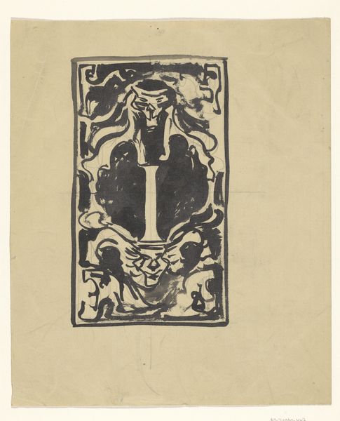
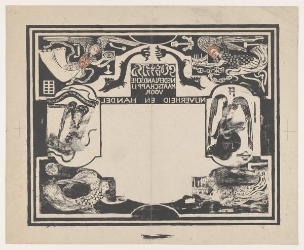
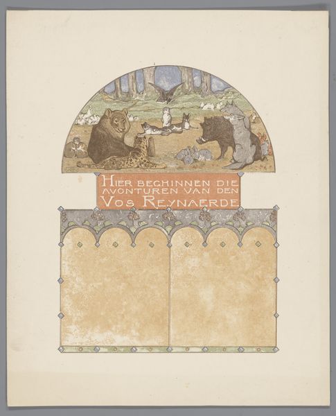
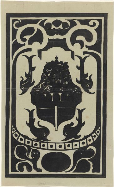
Advertentie van de Amsterdamse steen- en boekdrukkerij Dieperink & Co 1910
0:00
0:00
bernardwillemwierink
Rijksmuseum
graphic-art, print, poster
#
graphic-art
#
art-nouveau
#
blue ink drawing
# print
#
poster
Dimensions: height 254 mm, width 190 mm
Copyright: Rijks Museum: Open Domain
Curator: This advertisement for the Amsterdam printing house Dieperink & Co., dating from 1910, presents itself as a celebration of book production itself. Editor: It feels so...contained, yet fanciful. The muted color palette, that crown-like border—it’s aiming for both regal authority and approachable charm. What story is it trying to tell us about the business? Curator: Well, consider the elements. We see the year, a central vase, two silhouetted gentlemen—presumably potential clients—flanking either side. It appears to be promoting an exhibition of the printed book. Notice the way it combines typography with imagery typical of the Art Nouveau period. What we're truly viewing is a carefully crafted advertisement that showcases Dieperink & Co.’s skill in the printing trade. Editor: Right. But there’s also a subtle play with symbolism here. The vase, positioned at the visual heart of the piece, almost takes on an altar-like significance, as if the printed book is now an object of veneration itself. Do you see those faces reflected on the glass vase? One looks rather ominous... almost devilish. Curator: That vase probably served as decoration for the offices of Dieperink and company. While the symbolism is important, for me, understanding its physical presence contextualizes its place in this artwork. How readily could consumers access this printing house? Were they aware of the machinery of its production? Was it seen as fine art or trade work at the time? Editor: Interesting. I lean more towards cultural interpretations and how such motifs tap into our subconscious associations with printed media as repositories of wisdom or cultural heritage. Think about those small paintings displayed along the inner edges of the artwork – their placement imbues the business' printshop with artistic legacy. This firm understood branding, I think. Curator: Exactly! It underscores how a commercial entity, Dieperink & Co., leveraged visual artistry and material resources to present a sophisticated image of itself to its customer base. The convergence of materials and symbol reinforces its lasting appeal to our current experience of design. Editor: I can get behind that—this is an example of commercialism elevated. The use of symbolism allows the mundane to appear aspirational, creating an illusion that is sustained, ironically, via this very same sort of process. Curator: An interesting conclusion. Focusing on process lets us think more broadly about what is for sale here. Editor: Indeed, a rich intersection of the functional, artistic, and representational.
Comments
No comments
Be the first to comment and join the conversation on the ultimate creative platform.
More like this