Copyright: Norman Bluhm,Fair Use
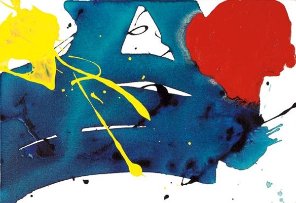
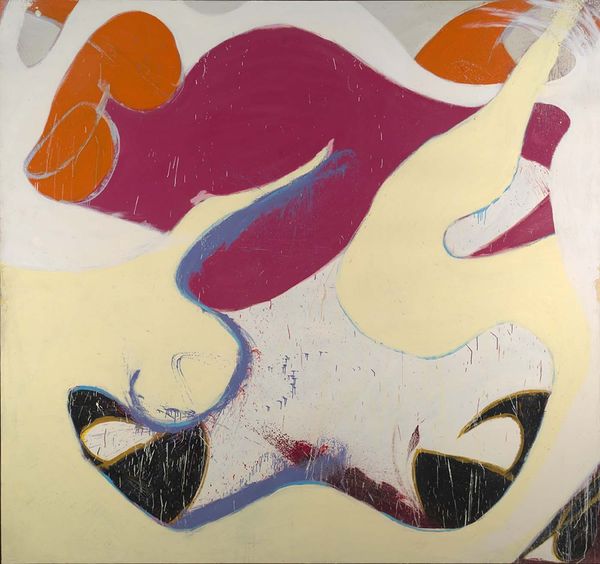
Norman Bluhm made this painting, Io, with oil on canvas. You can see how the colour palette relies on a few key colours: a creamy yellow, a deep blue, and expanses of white. This economy is so interesting to me, as a painter, because the focus really shifts to the application of the paint, to the process itself. Up close, you can see how the paint isn’t too thick or thin. The light bounces off the surface in an even way that gives it a very calm kind of presence. Notice the heavy blue form at the bottom of the canvas. You can see the brushstrokes going in different directions, and in some places it seems as if he might have used a rag to wipe away some of the paint, creating a mottled effect. The way he has built up the different layers and densities of pigment in this single area is incredible. Bluhm’s approach reminds me of Joan Mitchell, another abstract expressionist, but with a more buoyant touch. He shows us how an artwork can be an invitation to imagine things differently.
Comments
No comments
Be the first to comment and join the conversation on the ultimate creative platform.
More like this