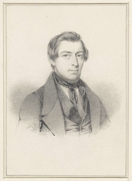
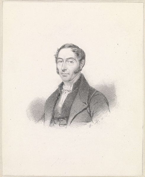
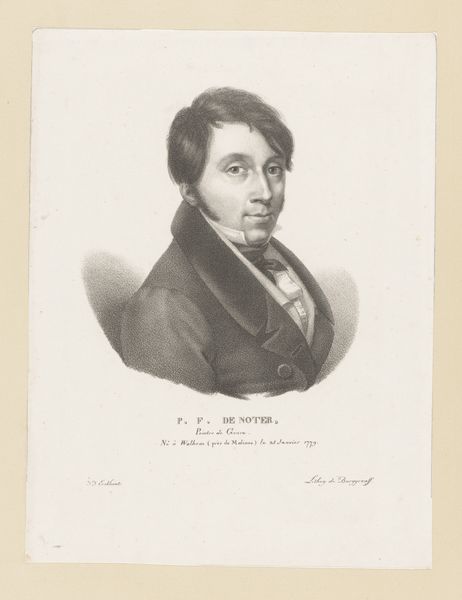
drawing, lithograph, print, paper
#
portrait
#
drawing
#
lithograph
# print
#
paper
#
pencil drawing
#
realism
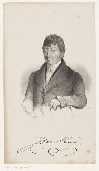
Dimensions: 156 × 156 mm (image); 326 × 251 mm (sheet)
Copyright: Public Domain
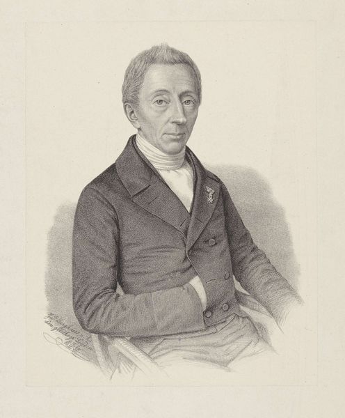
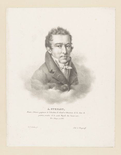
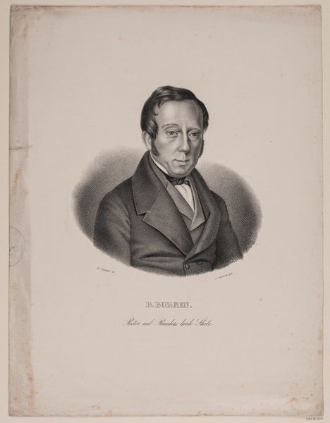
Editor: We’re looking at "Portrait of Pierre-Louis-Antoine Cordier," a lithograph from around 1825 by Jules Boilly, currently residing at The Art Institute of Chicago. It’s quite striking how lifelike the portrait is, almost photographic in its realism, especially given the medium. How do you read this portrait through a formal lens? Curator: The meticulous rendering of form through tonal gradations establishes a compelling presence. Note how Boilly uses the lithographic crayon to mimic the subtleties of a pencil drawing. The success of the work hinges on this delicate manipulation of light and shadow, a mastery of chiaroscuro. The almost obsessive detail in the subject's features is echoed in the ornate typography beneath. What visual connections can we draw from these seemingly disparate elements? Editor: I see the contrast – the strict geometry of the subject’s clothing versus the flowing calligraphy creates a visual tension. The typeface feels performative compared to the candidness of his face. Curator: Precisely. Consider the lines and patterns at play: the subject’s hairline mimicking the curves within the typographical flourishes, thereby softening the rigid angles of his coat. This speaks volumes to Boilly’s adept control over graphic language and the interplay of textural contrasts within a limited palette. Notice how the texture evokes a three-dimensional depth which offsets the two-dimensional printed letters. Editor: I see what you mean! It's almost as if Boilly is trying to bring him to life off the page. Thanks, that really helped me appreciate this portrait on a deeper level. Curator: Indeed. Considering the structural relationships within an artwork often unlocks its essence, revealing the artist's choices and intended impact.
Comments
No comments
Be the first to comment and join the conversation on the ultimate creative platform.
More like this