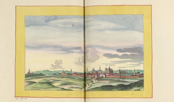
painting, watercolor
#
dutch-golden-age
#
painting
#
landscape
#
watercolor
#
cityscape
Dimensions: height 377 mm, width 282 mm, height 532 mm, width 319 mm
Copyright: Rijks Museum: Open Domain
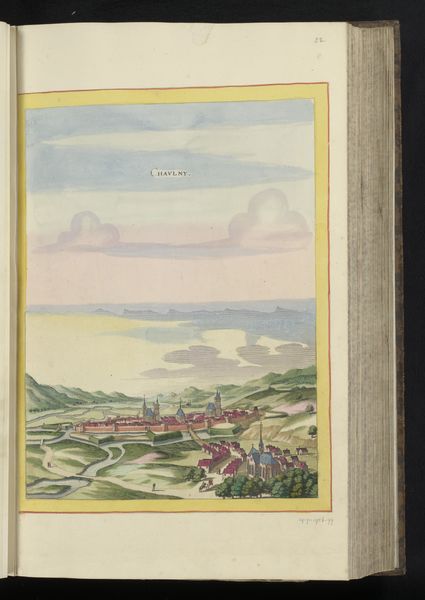
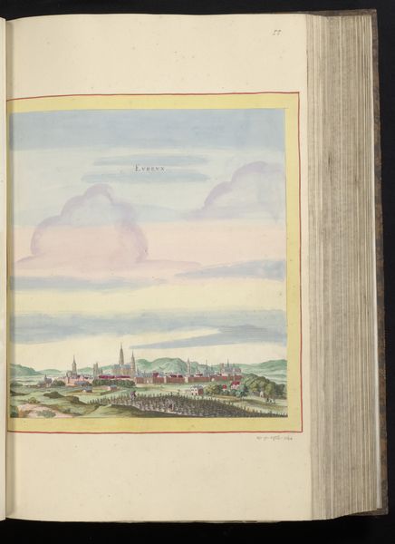
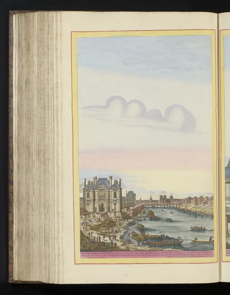
Curator: This watercolor, created around 1656, is titled “Gezicht op Laon.” It resides in the Rijksmuseum and while the artist is unknown, it's an exquisite example of Dutch Golden Age landscape artistry. What's your first impression? Editor: It's dreamlike. The soft colors, the layering of landscape—it almost feels like a stage set, presenting a romantic vision of civic life. I’m curious about the realities beneath this serene facade. Curator: Observe the composition, though. The high vantage point gives us a complete overview of the city, yet the individual structures are rendered with remarkable detail, and each layer receives as much care as any other in terms of depth. The use of watercolor adds to the airy feel, right? Editor: Precisely. That elevated perspective positions us as viewers but also as potential rulers, looking down upon the landscape and its inhabitants, maybe to control society with our gaze. Was this artistic choice intentional to support colonial views on class and power? Curator: The soft hues are intentional to lead us to think this way! The balance of color—the pastel sky offset by the greens and browns below creates a harmonic landscape; which invites the eyes and makes for interesting subject of formal exploration, like atmospheric effects. The texture achieved with watercolor is exquisite! Editor: And it masks realities. Dutch Golden Age art often presents a curated view of wealth and prosperity. Considering Laon’s historical position—perhaps even examining how the citizens were subject to poverty while also the subjects to wars, these elements remain notably absent here. It feels deliberately misleading. Curator: But even through this lens, we can appreciate how the work is crafted with color theory as the composition balances line and form, making the viewing experience so much more pleasurable than painful. Editor: Yes, the pleasure derived from these elements might make the real stories inaccessible; and maybe understanding that tension between aesthetics and representation can actually enrich the artwork! Curator: Agreed, a crucial aspect. The composition allows for reflection not just about beauty but power dynamics embedded within. Thank you for enriching our viewers insights today! Editor: Thank you. Exploring those tensions truly elevates our understanding.
Comments
No comments
Be the first to comment and join the conversation on the ultimate creative platform.
More like this