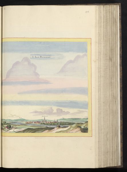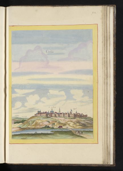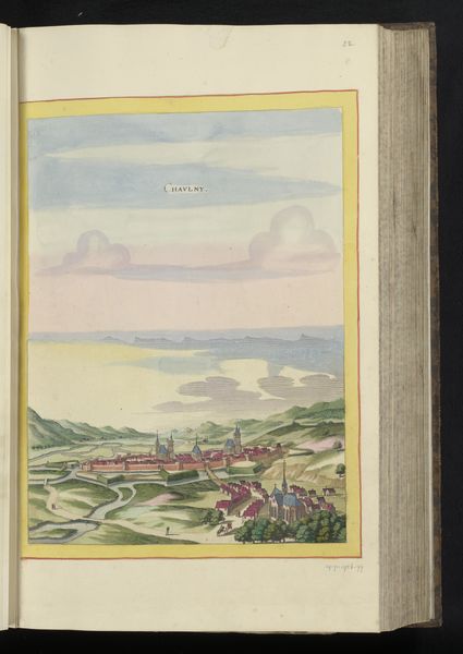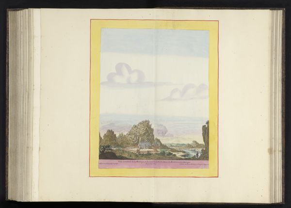
1656
Gezicht op Corbie
Anonymous
@anonymousLocation
RijksmuseumListen to curator's interpretation
Curatorial notes
Curator: It’s really quite charming, this delicately rendered Dutch Golden Age watercolor. Here we have an anonymous artist’s "View of Corbie," created around 1656. Look at the subtle washes! Editor: I find it immediately… underwhelming. The washes give it an ephemeral feel, as though Corbie is fading from memory or perhaps only half-formed as a concept. The pale sky looms so large and makes the architecture of the town seem incidental, a backdrop. Curator: I see it quite differently. Note the proportional relationships; the diminutive rendering of the city emphasizes its harmonious integration with the landscape. It is the quintessential Dutch ideal! A pastoral elegance defined by tranquility and compositional balance. The artist, in a purely formalist sense, has prioritized idealized aesthetics. Editor: I suppose I’m more interested in what this idealized landscape *masks*. Consider the socio-economic reality. The Dutch Golden Age was built on intense international trade and exploitation, which generated a great deal of social disparity that one could say, a painting like this artfully conceals! Do we know the origin of the watercolor paper itself? Its journey and its own complex manufacture? Curator: While such considerations may bear some relevance, focusing too intently on them distracts from appreciating the image's intrinsic beauty. Take, for example, the conscious design of pictorial space – notice the chromatic unity which allows a spatial illusion that pulls the viewer into the Dutch landscape... Editor: But aren't you curious about the materiality of watercolor as a favored medium of the elite merchant class? Easy to transport and share, as evidence, perhaps, of one’s wealth and cultured understanding? That subtle control over watery pigment was not exactly within the reach of the lower working class, I should think. Curator: You make fair points, of course. Yet, I maintain that such concerns shouldn't negate our ability to appreciate this cityscape as a perfectly constructed image with an emphasis on linear precision and muted palette to express a contemplative vision of place. The artist utilizes space, light, and delicate coloration to construct meaning. Editor: Perhaps both approaches reveal valuable layers. Considering how and why this work was produced enhances understanding beyond merely describing the composition and color harmonies, no? In some way, an exploration of materiality completes a painting's elusive narrative. Curator: Indeed. Viewing any piece with diverse viewpoints certainly enriches one’s perspective. Editor: I couldn't agree more.