graphic-art, print, typography, engraving
#
graphic-art
#
medieval
#
baroque
# print
#
old engraving style
#
typography
#
engraving
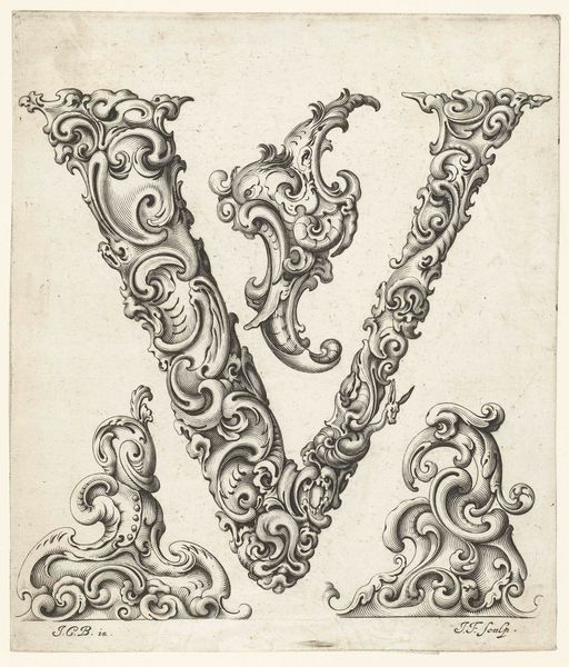
Dimensions: height 102 mm, width 99 mm
Copyright: Rijks Museum: Open Domain
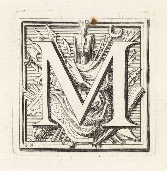
Curator: Welcome. Before us is a 1730 engraving titled "Letter M in een omlijsting met de kop van een monster," created by Johannes (I) Enschedé. Editor: The 'M' asserts itself forcefully, framed by intricate Baroque detailing. It evokes a darkly ornate feel; almost menacing with the inclusion of that little monster head right at the top. Curator: The initial 'M' would certainly have represented more than just the letter itself, wouldn’t you agree? Consider the potent symbolism inherent in illuminated manuscripts; that letter, the doorway to meaning, would serve as an icon, layered with intention. Editor: Absolutely, and I think we can explore it from a structuralist approach, looking at how the frame serves as a rigid structure, while organic shapes break from this rigidity. Curator: And then there’s the monster. In those days, images of fantastical beasts served a vital purpose. They weren’t merely decorative; they acted as warnings, visual reminders of chaos and the unknown lurking beyond societal norms. What narrative undercurrent is carried forth in this 'M'? Editor: The execution of detail fascinates me. The symmetry achieved within asymmetry; swirls echoing and balancing each other— the monster looks almost comical! It appears the engraver used light and dark to emphasize certain aspects of its being. Curator: Perhaps intended to diffuse fear, but its inclusion speaks volumes, connecting this single letter to a vast history of visual folklore, carrying both cultural and personal anxieties. Editor: It reminds us of the past as well as shows that these initial letter prints used their artistry to set tone through texture and shape. Curator: Exactly, each flourish adds a new semantic layer, inviting continuous reading and re-reading, beyond just its utility in alphabetical ordering or as a typographic beginning to a sentence. Editor: That small grotesque figure certainly adds depth and ambiguity. A reminder of mortality, or simply an ornamental fancy. Hard to say what Johannes intended. Curator: A lot to unpack indeed; it prompts a recognition of how visual communication echoes across generations through common symbols. Editor: Ultimately, its power lies in its masterful composition.
Comments
No comments
Be the first to comment and join the conversation on the ultimate creative platform.
More like this