drawing, print, architecture
#
drawing
#
neoclacissism
# print
#
geometric
#
architecture
Copyright: Public Domain
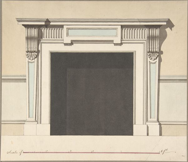
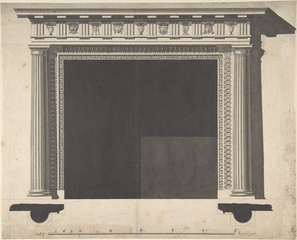
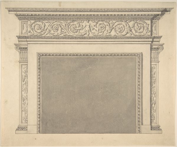
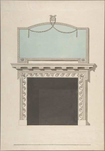
Editor: This is Sir William Chambers’s "Design for a Chimneypiece," created sometime between 1740 and 1800. It’s a drawing, almost print-like in its precision. The somber greys give it such a stark, imposing feel. What elements do you find particularly striking in this design? Curator: Immediately, the rigorous geometry asserts itself. Note the calculated ratios of the columns to the mantelpiece, a precise calibration establishing a clear hierarchy. Do you observe how the circular form at the base serves not just a functional purpose but also introduces a subtle counterpoint to the predominant linearity? Editor: Yes, the circle does soften the overall angularity. I also noticed the very subtle shading that almost seems like a ghostly apparition within the rectangular cavity. It creates an illusion of depth but doesn’t quite succeed, which makes me wonder why the artist chose to include it at all? Curator: The application of that tonal range invites a semiotic reading. It prevents a flat reading of depth; instead it emphasizes the material quality of the design. Further consideration can be given to the negative space, it is a pivotal design component because of how the lines dictate its boundaries. What are your impressions of its materiality in relation to the principles of Neoclassicism? Editor: The emphasis on geometric forms definitely evokes that classical connection but I hadn't thought about materiality that way before. Thank you for that insight! Curator: My pleasure. It's often in the interplay of form and concept that true understanding emerges.
Comments
No comments
Be the first to comment and join the conversation on the ultimate creative platform.
More like this