#
tree
#
neat line work
#
pen illustration
#
bird
#
junji ito style
#
ink line art
#
linework heavy
#
forest
#
pen-ink sketch
#
thin linework
#
pen work
#
coloring book page
#
doodle art
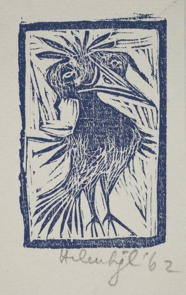
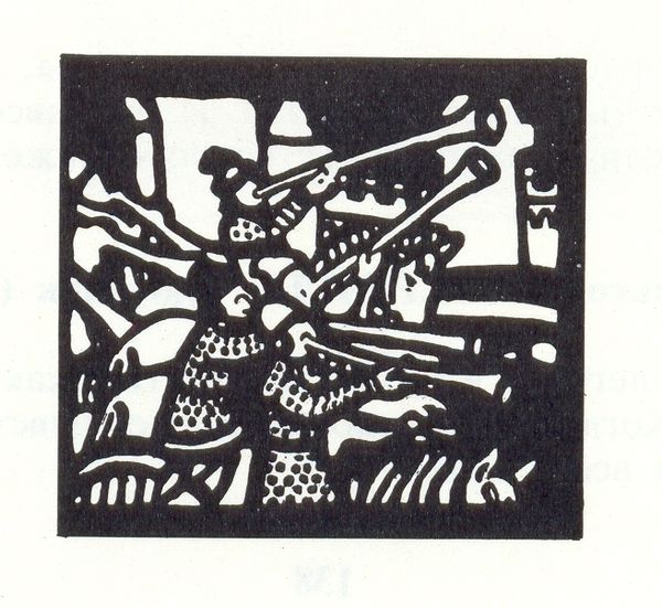
Copyright: Rafael Zabaleta,Fair Use
Editor: So, here we have "Partridges" by Rafael Zabaleta, rendered with some kind of ink. The mood is…quirky. All those watchful eyes. What catches *your* eye in this piece? Curator: It reminds me of staring into a forest primeval, thick with untold stories whispered among the trees. It's got that raw, honest quality. There's a kind of deliberate roughness, a deliberate *un-prettiness* in Zabaleta’s work, which sings to my soul. Does the thick linework and almost harsh contrast evoke something similar for you, a kind of primordial feeling? Editor: Definitely! There's an almost unsettling intensity in their gazes, but it’s also strangely humorous. I'm curious about why Zabaleta might have chosen to depict them in such a stylized, almost cartoonish way. Curator: Well, artists often walk this tightrope between representation and interpretation. Maybe he was aiming for a universal quality, an Every-bird, stripped down to its essence. Perhaps, by exaggerating certain features – the eyes, those spiral patterns on their chests – he's commenting on something larger. Maybe a silent judgement on humankind, using birds as their unimpressed stand-ins. What do *you* make of that decorative flourish? Editor: That’s interesting, using the spiral motif that way… I hadn’t thought about it possibly pointing to humans at all. It does give it an abstracted sort of tension, like decoration with a point, or rather a barb. Curator: Exactly! These artistic choices never just appear in a vacuum, do they? Sometimes the simplest-seeming images carry the greatest echoes. Editor: Right, I’m going to start looking at linework completely differently now!
Comments
No comments
Be the first to comment and join the conversation on the ultimate creative platform.
More like this